| Author | Thread |
Comments Made During the Challenge  |
|
|
04/18/2005 05:59:38 AM |
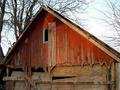
| nice color. crop needs work. whites need work, blacks ok |
|
|
|
04/17/2005 01:54:20 PM |
| I think the color saturation and dead center placement of the building distracts from the composition. |
|
|
|
04/17/2005 06:02:44 AM |
| Is there a side to this building? If you look through the window on the right and under the eaves of the roof, it appears to be a facade with no sides. Try moving off center so that you add some dimension. |
|
 Photographer found comment helpful. Photographer found comment helpful. |
|
|
04/14/2005 10:38:21 AM |
| the overgrowth is cluttering this image, tho i guess that is the nature of an abandoned bldg. some loss of fine detail lost but a good subject |
|
| Photographer found comment helpful. |
|
|
04/13/2005 06:36:53 PM |
| too much foreground and not enough sky |
|
| Photographer found comment helpful. |
|
|
04/13/2005 12:43:12 PM |
| This is so cool! You can really imagine a beautiful, colorful little cottage that once was from looking at this! It just adds to the abandonment feeling of it. Good job! |
|
| Photographer found comment helpful. |
|
|
04/13/2005 05:01:06 AM |
| see this is why you should always use clay tiles on your roof. The photo has way to much landscape in in for my liking tho but does suggest abandoned. I also find the photo to lack clarity and appears to be a little OoF. Good luck in this challenge. |
|
| Photographer found comment helpful. |
Home -
Challenges -
Community -
League -
Photos -
Cameras -
Lenses -
Learn -
Help -
Terms of Use -
Privacy -
Top ^
DPChallenge, and website content and design, Copyright © 2001-2025 Challenging Technologies, LLC.
All digital photo copyrights belong to the photographers and may not be used without permission.
Current Server Time: 04/07/2025 01:24:10 PM EDT.