| Author | Thread |
Comments Made During the Challenge  |
|
|
04/19/2005 09:37:31 PM |
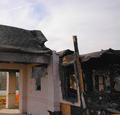
| Wow, that is creepy, did you go inside??? The colors are a little overdone IMO, sorry |
|
 Photographer found comment helpful. Photographer found comment helpful. |
|
|
04/19/2005 07:14:06 PM |
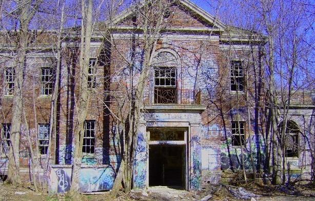
this photo makes think of a scary horror movie, i really like it.
and the blue tones to the house are unusual but wonderful. |
|
| Photographer found comment helpful. |
|
|
04/19/2005 03:45:14 PM |
| This just looks a bit over-exposed or over-saturated, one. Granted, that does add to the unsettling nature of the shot, so maybe it's not a bad thing. |
|
| Photographer found comment helpful. |
|
|
04/18/2005 11:30:51 AM |
Weird color. Sky looks purple. Over saturated or too much color shift maybe?
Even without that, I think the subject is not appealing; there is too much tree. |
|
| Photographer found comment helpful. |
|
|
04/16/2005 09:41:00 PM |
| Seems a bit overly blue/purple on my monitor. |
|
| Photographer found comment helpful. |
|
|
04/15/2005 10:53:42 PM |
Still having a problem viewing this. My monitor? Transmission / upload issues? The twigs, branches seem pixelated, and the blues feel chalky. The trees aren't "popping" - maybe that's it.
You're right, though. "Blurred" really isn't the correct word. |
|
| Photographer found comment helpful. |
|
|
04/15/2005 12:26:24 PM |
|
| Photographer found comment helpful. |
|
|
04/15/2005 11:02:55 AM |
| cool building, colors are very distracting...not sure if that was how your shot it or post production but it hurts the image badly. I think just b/w or sephia may have worked better. Sorry |
|
| Photographer found comment helpful. |
|
|
04/14/2005 09:24:34 PM |
| Too many hot spots. I would have toned it down just a bit. Very interesting building but the light keeps pulling my attention away from it. |
|
| Photographer found comment helpful. |
|
|
04/14/2005 07:08:32 PM |
| I think this would have been much better without the errant colors on the face of the building. Looks nice and sharp with good exposure. |
|
| Photographer found comment helpful. |
|
|
04/14/2005 12:37:17 PM |
| very. Looks similar to the place I shot my image at. I think this may be over sharpened. looks like a great place to explore! |
|
| Photographer found comment helpful. |
|
|
04/14/2005 09:51:41 AM |
| nice image, i like the graffiti on the walls of the building because it makes it look more abandoned |
|
| Photographer found comment helpful. |
|
|
04/13/2005 06:03:33 PM |
| the blue in the building and the bright blue sky is distracting to the overall image IMO. IMO again, it takes away from the brick reds/yellows and the green and brown in the foliage. Maybe a good touch though if not so intense. |
|
| Photographer found comment helpful. |
|
|
04/13/2005 05:58:40 PM |
|
| Photographer found comment helpful. |
|
|
04/13/2005 05:55:20 PM |
|
| Photographer found comment helpful. |
|
|
04/13/2005 05:49:28 PM |
| But can't you just imagine it in its hey day!!! really like th eblue tones. I just can't imagine people leaving such a neat building to fall apart! I want it :) |
|
| Photographer found comment helpful. |
|
|
04/13/2005 12:39:53 PM |
|
| Photographer found comment helpful. |
|
|
04/13/2005 12:39:39 PM |
| This picture need color adjustment .. ir |
|
| Photographer found comment helpful. |
|
|
04/13/2005 10:46:50 AM |
|
| Photographer found comment helpful. |
|
|
04/13/2005 10:05:40 AM |
| interesting building but far to busy with the trees in the way. Perhaps a tighter crop and a bigger photo woul have made for a better submission. |
|
| Photographer found comment helpful. |
|
|
04/13/2005 03:38:07 AM |
| creepy alright...what a day it was |
|
| Photographer found comment helpful. |
|
|
04/13/2005 12:42:33 AM |
|
| Photographer found comment helpful. |
Home -
Challenges -
Community -
League -
Photos -
Cameras -
Lenses -
Learn -
Help -
Terms of Use -
Privacy -
Top ^
DPChallenge, and website content and design, Copyright © 2001-2026 Challenging Technologies, LLC.
All digital photo copyrights belong to the photographers and may not be used without permission.
Current Server Time: 02/01/2026 07:56:48 AM EST.