| Author | Thread |
Comments Made During the Challenge  |
|
|
04/19/2005 05:58:38 AM |
Couple comments:
Met the challenge, that's for sure, but a few things could have used improvement, such as using a polarizer to help darken the sky (if shot at the right time of day), The roof line is a bit tilted to the right (and may be exactly like that, but titled images never seem to fair well in a challenge) and last, try taking the image into Photoshop (assuming you have it), and in the Hue/Saturation adjustments, take the yellow channel hue and saturation to the right a little (may 10 pts) and bright the lightness down a bit (10-20 pts) to give the yellows more of a darker, richer green look, and bring the red saturation up just a little.
|
|
|
|
04/18/2005 03:05:48 PM |
| Lines running through the picture are distracting. Lighting seems very harsh. |
|
|
|
04/17/2005 10:19:00 AM |
| Looks pixelated. Did you enlarge this too much? |
|
|
|
04/16/2005 12:49:56 PM |
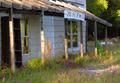
| Obviously, to maintain any detail in that frontage, you had to over-expose the sky; nevertheless, that over-exposure is not helping this image for me - I would rather in fact that the entire sky was blown out. That said, there is good sense of texture and detail and tone in the building. Difficult, without knowing your equipment, expertise, or intent, to recommend the best approach to fix this. |
|
|
|
04/16/2005 03:47:53 AM |
| The image size make this photo very hard to look at because it has been compressed so much it looks fuzzy/blurry. I also find the shot was taken from to far of distance and the landscape in front was really needed. With so much distance its really hard to tell what kind of building I'm looking at or what the photo is supposed to be about. Also the level of your camera is slightly off and the photo could have used approx 1 degree ccw rotation. Good luck in this challenge. |
|
|
|
04/15/2005 11:51:30 PM |
| the large amount of bland sky doed nothing a grey or ND grad woulgd have solved this problem 6 |
|
|
|
04/15/2005 06:27:40 PM |
| Looks a little bit over sharpened. |
|
|
|
04/15/2005 10:40:04 AM |
| Interesting pic. The sky is a bit too overexposed though. |
|
|
|
04/14/2005 01:55:26 AM |
| Some pixelation problems, perhaps with the resizing. Good subject for this challenge. Sky is over exposed. |
|
|
|
04/13/2005 08:49:41 PM |
| Sky is a little bright and building is too centered. The roof looked like it might be of interest and maybe a different angle would have worked better. |
|
|
|
04/13/2005 09:34:28 AM |
| This may have been more interesting closer up, so we could see some of the textures. Or maybe at more of an angle. MIght as well crop off most of the sky, too, since there's nothing much going on. Then it is a more dramtic shape. This location looks like a goldmine for creative photos. |
|
Home -
Challenges -
Community -
League -
Photos -
Cameras -
Lenses -
Learn -
Help -
Terms of Use -
Privacy -
Top ^
DPChallenge, and website content and design, Copyright © 2001-2026 Challenging Technologies, LLC.
All digital photo copyrights belong to the photographers and may not be used without permission.
Current Server Time: 02/01/2026 09:02:05 AM EST.