| Author | Thread |
|
|
05/20/2002 07:39:00 AM |
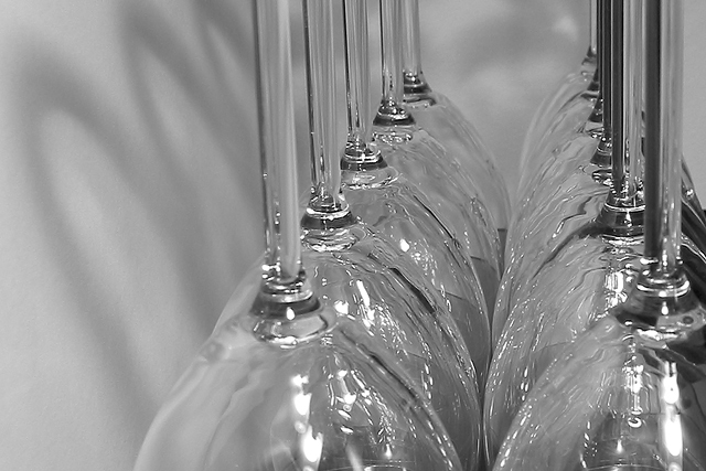
| Woohoo, I got no ones. This is actually quite drastically cropped from a larger picture which included the entire glasses. I wanted to emphasize what I thought was the most interesting part of the photo - the reflections that the glasses made on each other and the shadows on the matboard I was holding up next to them. I had a vertical composition, but liked this better as it seemed a bit more unique. I'm surprised that no one commented on the missing glass, or on the fact that the perspective really is off for a photograph. The title referred to the fact that I thought that the reflections looked like ripples on water. |
|
Comments Made During the Challenge  |
|
|
05/19/2002 08:20:00 PM |
| Nicely setup, the reflections are great, however; I don't like the dead space on the left |
|
|
|
05/19/2002 06:32:00 PM |
I would like to see more contrast.
//arnit.hamstur.is/arni/more_contrast.jpg |
|
|
|
05/19/2002 03:58:00 PM |
| I don't quite no what to say about this one. I like the look of the glasses -- given the title, I don't know if there's actually water sprayed up in them, or if the weird reflections are cellophane, or if that's just the way the glasses look. The only thing I really have to suggest might be trying a vertical composition instead of horizontal. |
|
|
|
05/17/2002 12:27:00 AM |
| technically sound photo in my opinion, but i'm just not interested |
|
|
|
05/16/2002 08:00:00 AM |
| What a nice simple composition, b&w works very well here. |
|
|
|
05/15/2002 12:56:00 PM |
| I do very much like this type of picture although it is not a "decoration" picture, more a technical shot and one that is quite difficult to achieve. Outside reflections creep in. If is a picture to be technically proud of. |
|
|
|
05/15/2002 11:27:00 AM |
| Excite me, please. Photo 9 Creativity 5 Upsidedown 7 total 7 |
|
|
|
05/14/2002 03:11:00 PM |
|
|
|
05/13/2002 10:57:00 PM |
Beautiful! Love the shadows, the angles.........and contrast!
Sort of feel like its cropped too much on top, would've like seeing at least part of the bottoms, but maybe that didn't work in the shot setup.
Good Job! |
|
|
|
05/13/2002 10:22:00 PM |
| I'm not sure I like the cropping here, but it definitely has a style of its own |
|
|
|
05/13/2002 05:59:00 PM |
| i like the shot, but I think more controlled lighting would have helped |
|
|
|
05/13/2002 05:25:00 PM |
| sweeet ... this is like soo classicly cool |
|
|
|
05/13/2002 01:31:00 PM |
| Beautiful shot..The lighting and composition are great. |
|
|
|
05/13/2002 12:30:00 PM |
| I think B& W was a good call. I'm glad it's off center. Nice. |
|
|
|
05/13/2002 08:18:00 AM |
| An army of glasses... I love all the catchlights. |
|
|
|
05/13/2002 08:03:00 AM |
| Great technique but not all that creative and imaginative. |
|
|
|
05/13/2002 07:34:00 AM |
| Nice use of black and white |
|
|
|
05/13/2002 03:16:00 PM |
| Excellent shot here... I like the lighting and the composure... good job! |
|
|
|
05/13/2002 03:10:00 PM |
Creative, clear, sharp and on topic for the challenge.
Well done, good work here. Nice!!! |
|
|
|
05/13/2002 02:50:00 AM |
| People came up with some gorgeous black and white shots for this challenge, this being one of them :). The shadows on the wall, the highlights in the glasses, the shapes of the glasses and stems all gel really well for me, and black and white enhances it considerably. I feel like I'm giving out too many 10s, but here goes another one! |
|
Home -
Challenges -
Community -
League -
Photos -
Cameras -
Lenses -
Learn -
Help -
Terms of Use -
Privacy -
Top ^
DPChallenge, and website content and design, Copyright © 2001-2026 Challenging Technologies, LLC.
All digital photo copyrights belong to the photographers and may not be used without permission.
Current Server Time: 02/01/2026 05:11:18 AM EST.