| Author | Thread |
|
|
06/23/2005 08:31:25 AM |
| Love the mood this evokes!! Well done. |
|
 Photographer found comment helpful. Photographer found comment helpful. |
Comments Made During the Challenge  |
|
|
04/19/2005 06:52:48 PM |
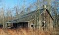
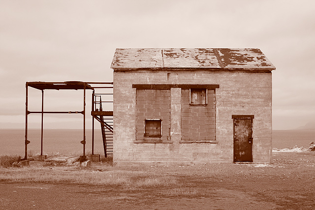
| I like the centered composition, just wish your tones were a little deeper. ; Nice inclusion of the structure on the left, whatever it is |
|
| Photographer found comment helpful. |
|
|
04/19/2005 07:14:35 AM |
evokes a feeling of desolation...would like to see the contrast of this area on a bright, sunny day in full color.
|
|
| Photographer found comment helpful. |
|
|
04/19/2005 12:23:40 AM |
| Like the tone used in this photograph. Would like to see a bit cropped off to the right. Good shot. |
|
| Photographer found comment helpful. |
|
|
04/18/2005 10:28:43 AM |
| Simple but powerful. Good one. |
|
| Photographer found comment helpful. |
|
|
04/18/2005 05:40:42 AM |
| This is a neat image, i like the color tone of the image, and i like how it is basically in the middle of nowhere. Nice shot |
|
| Photographer found comment helpful. |
|
|
04/17/2005 11:25:53 PM |
At first, this shot didn't "do it" for me.
After sitting here looking at it for a while, it grew on me.
It's simplistic stark approach works well. Not sure about the toning, but that is easily changed if it were mine.
Well Done! |
|
| Photographer found comment helpful. |
|
|
04/17/2005 07:50:48 PM |
| I really like this one. It is sharp, and I like the color and tones you chose for it. Fits challenge perfectly, and title fits it well. NIcely cropped. |
|
| Photographer found comment helpful. |
|
|
04/17/2005 09:57:24 AM |
| I like this, but might have preferred it in straight b&W |
|
| Photographer found comment helpful. |
|
|
04/16/2005 09:25:46 PM |
| Interesting background. The building lacks depth. Perhaps by moving off center and slightly at an angle, you would have a more 3-dimensional effect. |
|
| Photographer found comment helpful. |
|
|
04/16/2005 10:32:11 AM |
| Great shot ... soo simple but perfect |
|
| Photographer found comment helpful. |
|
|
04/15/2005 06:14:12 PM |
| Too squared to feel interesting. The pinkish (purple-toned) overcast is strange. |
|
| Photographer found comment helpful. |
|
|
04/13/2005 11:37:36 PM |
| Is the toning perhaps a little heavy? Together with what feels like a heavily reduced dynamic range - all midtones, and few highlights or real shadow - it sems like an attempt to reproduce the feel of aged photographs; which point I get, though I wonder if the effect hasn't removed too much of the sense of detail I would want to see in a very straightforward 'portrait' like this. |
|
| Photographer found comment helpful. |
|
|
04/13/2005 06:30:30 PM |
Something a little less straight on would have worked better I believe. I like your tone and the texture of the block work though.
|
|
| Photographer found comment helpful. |
|
|
04/13/2005 12:04:19 PM |
|
| Photographer found comment helpful. |
|
|
04/13/2005 10:58:32 AM |
| tell me where this is pse, after :) |
|
| Photographer found comment helpful. |
|
|
04/13/2005 08:41:48 AM |
| Very nice indeed. I like the monochrome. |
|
| Photographer found comment helpful. |
|
|
04/13/2005 05:21:21 AM |
| nice photo, nice way to use a one-color theme in this photo, makes it look older and more abandoned |
|
| Photographer found comment helpful. |
|
|
04/13/2005 05:03:20 AM |
| I really like this shot, but to me it is lacking something, maybe a bit more contrast would make it pop a bit more. |
|
| Photographer found comment helpful. |
Home -
Challenges -
Community -
League -
Photos -
Cameras -
Lenses -
Learn -
Help -
Terms of Use -
Privacy -
Top ^
DPChallenge, and website content and design, Copyright © 2001-2025 Challenging Technologies, LLC.
All digital photo copyrights belong to the photographers and may not be used without permission.
Current Server Time: 04/07/2025 12:44:10 AM EDT.