| Author | Thread |
Comments Made During the Challenge  |
|
|
04/12/2005 07:37:47 PM |
It's Zee
- I'm canadian :P |
|
|
|
04/12/2005 03:33:07 PM |
| Zed here in Canada. Good colours and composition. Wish it was a little sharper. |
|
 Photographer found comment helpful. Photographer found comment helpful. |
|
|
04/12/2005 08:08:27 AM |
| Good visible "Z", a tad oversaturated for me, not sharp enough IMHO. |
|
| Photographer found comment helpful. |
|
|
04/11/2005 05:21:16 PM |
| Really like the color on this one, just looks the slightest bit soft. But, great composition |
|
| Photographer found comment helpful. |
|
|
04/10/2005 01:25:43 PM |
the 2 colours work very well here
nice Zees |
|
| Photographer found comment helpful. |
|
|
04/10/2005 06:56:11 AM |
| NIce color, but a little too soft. |
|
| Photographer found comment helpful. |
|
|
04/08/2005 07:16:24 AM |
| Nice, nice concept and comp. A little too red though. |
|
| Photographer found comment helpful. |
|
|
04/08/2005 06:00:01 AM |
thats funny i thought i saw this already
not to original |
|
| Photographer found comment helpful. |
|
|
04/07/2005 02:06:39 PM |
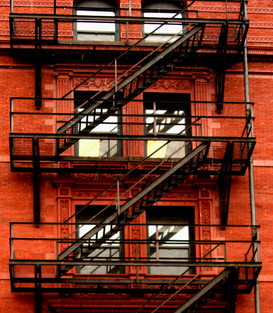
| Would have been better for this challenge if you had cropped it so that there was only one Z, otherwise a really nice photo. |
|
| Photographer found comment helpful. |
|
|
04/07/2005 12:41:54 PM |
| Nice idea. The building looks just a little over saturared or something. The focus also looks a little soft. |
|
|
|
04/07/2005 10:27:02 AM |
| Layers of Z! nicely done! |
|
| Photographer found comment helpful. |
|
|
04/07/2005 07:04:56 AM |
| though you have a terrific shot, in visual terms, I feel your photo is too soft and a bit oversaturated (at least on my monitor it appears to be so). Neverthless, it stands out. |
|
|
|
04/06/2005 10:43:30 PM |
| nice capture, but lacking in sharpness. try a USM filter at 100%, .5, 0. |
|
|
|
04/06/2005 06:35:42 PM |
| seems a little out of focus. Good eye though! |
|
| Photographer found comment helpful. |
|
|
04/06/2005 01:28:17 PM |
| interesting subject, not very detailed |
|
| Photographer found comment helpful. |
|
|
04/06/2005 01:02:48 PM |
|
| Photographer found comment helpful. |
|
|
04/06/2005 10:51:23 AM |
Would've framed a little higher to get the top two windows.
Seems a little out of focus too.
Like the colors though :) |
|
| Photographer found comment helpful. |
|
|
04/06/2005 09:20:15 AM |
| The focus seems a little too soft |
|
| Photographer found comment helpful. |
|
|
04/06/2005 12:19:06 AM |
| well you probably should have titled it "is it zee or zed" Either way, the colours here are great - good choice of subject, sadly, the shot is a bit out of focus and it would be a little better if you rotated the stairs just a little, so they were horizontal. |
|
| Photographer found comment helpful. |
|
|
04/05/2005 11:58:05 PM |
| You mean Zee or Zed? I think the red on the walls is overpowering what I should be looking at here. But yeah, I can see the Z. |
|
| Photographer found comment helpful. |
|
|
04/05/2005 08:41:34 PM |
| If I tilt my head, it's "Ned" ;-) I like this one. |
|
| Photographer found comment helpful. |
Home -
Challenges -
Community -
League -
Photos -
Cameras -
Lenses -
Learn -
Help -
Terms of Use -
Privacy -
Top ^
DPChallenge, and website content and design, Copyright © 2001-2025 Challenging Technologies, LLC.
All digital photo copyrights belong to the photographers and may not be used without permission.
Current Server Time: 04/07/2025 04:44:41 AM EDT.