| Author | Thread |
|
|
04/07/2003 10:37:54 AM |
Thanks for all of the great feedback. I took everybody's comments and came up with a better rendition of the photo. I've posted it here:
//www.dpchallenge.com/image.php/i/17270
This was my first challenge, so it was very much a learning experience!
Dave - a.k.a. whitetiger |
|
Comments Made During the Challenge  |
|
|
04/06/2003 08:16:24 PM |
| Great idea, a bit rough on the edges but very good. |
|
 Photographer found comment helpful. Photographer found comment helpful. |
|
|
04/04/2003 11:55:42 AM |
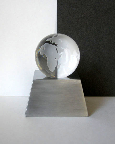
| That's clever! I like the way the colours reverse inside the globe. I think I'd crop out some of the foreground though. |
|
| Photographer found comment helpful. |
|
|
04/04/2003 08:18:28 AM |
| Nice idea but the lighting isn't brash enough to really make the best of it. I think I'd have moved in closer and perhaps lost the floor/tabletop in order to focus on the globe which really is the star of this show. I think then I'd have darkened the room around and used a strong light somewhere behind and left of the globe to really get the light streaming through the glass. The trick here will be to keep the light in the white half and off the black half. Altogether a really interesting subject and great idea. Well done. 7 - floyd |
|
| Photographer found comment helpful. |
|
|
04/03/2003 08:09:03 AM |
| An abstract feel. Nice texture throughout. |
|
| Photographer found comment helpful. |
|
|
04/02/2003 11:04:51 AM |
| You might have wanted to crop this a little closer. |
|
| Photographer found comment helpful. |
|
|
04/01/2003 11:35:29 PM |
| Well done~ I especially like the opposite colour in the crystal globe |
|
| Photographer found comment helpful. |
|
|
04/01/2003 10:36:09 PM |
| Just a bit grainy. Sharper focus would really do this pic justice. |
|
| Photographer found comment helpful. |
|
|
04/01/2003 02:06:45 PM |
| good job, the symetry pulls the picture together. |
|
| Photographer found comment helpful. |
|
|
04/01/2003 01:53:40 PM |
| nice clear image, good idea |
|
| Photographer found comment helpful. |
|
|
04/01/2003 11:06:47 AM |
| The tones aren't quite right for me. I;m expecting to see true black/white, but the colors seem muddy. There's also what appears to be noise/grain on the black part of the background. The whole image feels excessively soft fo me. But I do like the concept and your choice of models. |
|
| Photographer found comment helpful. |
|
|
03/31/2003 10:19:30 PM |
| Very nicely done! Suggestions would include working to reduce or eliminate the shadow on the right side of the stand, and to make your black background more completely black. |
|
| Photographer found comment helpful. |
|
|
03/31/2003 08:02:30 PM |
| this truly had potential. I think there may not have been enough of light, and maybe you had to over adjust it in post processing? Great idea! I'd like to try something like this sometime. and this image can really make a statement. My suggestion would be to use better lighting.. then, come in close in order to frame it without the stand. cut white and black paper to fit around the base of the globe to make it look floating? worth reworking. :0) |
|
| Photographer found comment helpful. |
|
|
03/31/2003 06:47:27 PM |
Maybe should have zoomed in a little more. Or tried to get the 3 areas of white, grey, and black more equal in demensions.
|
|
| Photographer found comment helpful. |
|
|
03/31/2003 12:40:59 PM |
| There seems to be some distortion on the white background. Great picture, though! |
|
| Photographer found comment helpful. |
|
|
03/31/2003 01:40:32 AM |
| I like how the black and white get reflected in the globe. Seems a little out of focus and grainy. |
|
| Photographer found comment helpful. |
Home -
Challenges -
Community -
League -
Photos -
Cameras -
Lenses -
Learn -
Help -
Terms of Use -
Privacy -
Top ^
DPChallenge, and website content and design, Copyright © 2001-2026 Challenging Technologies, LLC.
All digital photo copyrights belong to the photographers and may not be used without permission.
Current Server Time: 02/01/2026 10:00:00 AM EST.