| Author | Thread |
|
|
04/11/2003 07:03:39 AM |
Critique Club Comments by Grayce
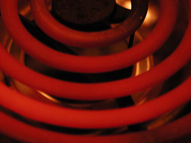
Bruster,
I like this simplicity of this composition very much. If you had not kept this simple it would have eradicated the highly graphic quality that you captured.
The color of the coil is good, and leaves no doubt in anyone's mind that it is HOT, Hot, Hot!
Focus isn't as crisp as it could be. Perhaps post-processing may have benefited this.
OVerall a good idea, that could be improved upon.
Best of luck in all your photo endeavors.
Regards,
Grayce |
|
Comments Made During the Challenge  |
|
|
04/06/2003 07:16:40 AM |
| really red red red. good focus, good color. |
|
|
|
04/05/2003 07:31:32 PM |
| doesn't show the kind of intense detail that your obviously decent macro lens is capable of. nice pattern, could use some more rich texture. |
|
|
|
04/03/2003 09:18:48 AM |
| Looks pretty hot to me! Focus seems to be on the upper portion of the photo (why not the whole?). Color seems about right. Interest - I thought this might be an interesting shot too, but decided against it (low to moderate). The drip tray seems nicely clean (a second reason why I didn't go this direction, I'd have to clean the tray!). 6 Rob the Swash |
|
|
|
04/02/2003 09:19:54 AM |
| generally out of focus maybe the heat did help focussing. godd idea though! |
|
|
|
03/31/2003 12:06:02 AM |
| Great idea but the execution just isn't there. Were this one if focus, I think you could add a whole point to your final score. Unfortunately it isn't. |
|
|
|
03/30/2003 10:07:42 PM |
| Seems slightly out of focus, and perhaps more of the ring would have more impact. Hope you didn't burn yourself :-) |
|
Home -
Challenges -
Community -
League -
Photos -
Cameras -
Lenses -
Learn -
Help -
Terms of Use -
Privacy -
Top ^
DPChallenge, and website content and design, Copyright © 2001-2025 Challenging Technologies, LLC.
All digital photo copyrights belong to the photographers and may not be used without permission.
Current Server Time: 04/07/2025 12:51:49 PM EDT.