| Author | Thread |
|
|
04/11/2003 10:19:07 PM |
CRITIQUE CLUB CRITIQUE
by karmat
(This is the third time I have typed this comment, for various reasons, it keeps getting lost, so if it appears short and choppy, that is why. If you have any questions or comments, please feel free to contact me, and I will elaborate.)
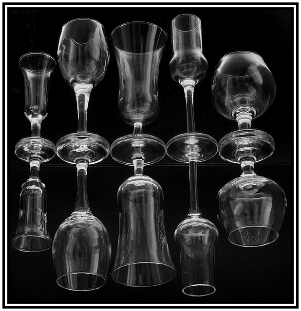
This is simply an awesome shot. The staggering of the two sizes of glasses adds interest, I think, and the different "types" or shapes of glasses really adds a sense of randomness that adds context to the shot for me. It's almost like they are sitting on a bar or counter, waitign to be used. The off-levelness of it is a bit disconcerting, but i see in you comments why that is done that way.
Very well done focus and lighting. I am very impressed that hte reflections are as well focused as the "originals." Also, the light reflections are okay with me. They are glasses. Glasses reflect. If you could have prevented that, I think it would have looked unnatural. Better reflections than fingerprints and smudges.
This is a very elegant shot. I think the black and white works very well, though I think color (either by lights or in post processing) could be used to sit various moods effectively. Nicely done.
karmat |
|
 Photographer found comment helpful. Photographer found comment helpful. |
Comments Made During the Challenge  |
|
|
04/06/2003 01:33:13 PM |
| Really clear shot. Fantastic. |
|
|
|
04/05/2003 11:08:39 PM |
| oh my god, im so sorry for giving you a 6 for my initial scoring, after a final viewing, i updated your score to a perfect 10. honestly, i selected 5 entries for my 10s. and after a few hours of reviewing it, i drop the other on its technical aspect. On my first round of rating, i selected the images on its visual impact and my final rating i'll based it on technical aspect. You got my vote on its technicality. The image is so neat, the reflection is so amazing and the arrangement of glasses is so beautiful. Excellent work, im so excited to the blue ribbon on this image. Take a bow now...i do hope my choices for this challenge will make it to the top!!!! GOOD LUCK. |
|
| Photographer found comment helpful. |
|
|
04/04/2003 11:35:09 AM |
| I like the reflections. Looks slightly tilted to the left - would have more impact if not, I think. Good lighting. |
|
| Photographer found comment helpful. |
|
|
04/03/2003 07:22:14 AM |
| Now this is cool. Love the way you have set up these glasses. Very well done. I love the composition and lighting as well. Great job and GL in this weeks challenge. |
|
|
|
04/01/2003 10:33:51 PM |
| Nicely done. I think I'll have a brandy. |
|
|
|
04/01/2003 01:57:18 PM |
| nice clear image, good idea |
|
|
|
04/01/2003 12:25:27 AM |
| I'm staring at it "saying ok how did you do that?" |
|
|
|
03/31/2003 05:54:03 PM |
| This is another one that might be better rotated 90 degrees. But it's great like this also. |
|
| Photographer found comment helpful. |
|
|
03/31/2003 04:45:01 PM |
| Great modern art. Makes me thirsty. |
|
|
|
03/31/2003 01:14:52 PM |
| really good picture. nice lighting and use of blank space in background. |
|
| Photographer found comment helpful. |
Home -
Challenges -
Community -
League -
Photos -
Cameras -
Lenses -
Learn -
Help -
Terms of Use -
Privacy -
Top ^
DPChallenge, and website content and design, Copyright © 2001-2026 Challenging Technologies, LLC.
All digital photo copyrights belong to the photographers and may not be used without permission.
Current Server Time: 02/01/2026 11:01:33 AM EST.