| Author | Thread |
|
|
04/11/2005 12:58:43 PM |
Greetings From The Critique Club!!
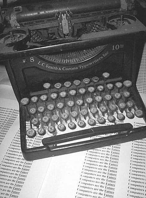
Initial impact: Very unusual.. Definately outside the box!!
Meeting the challenge: Yes this fits the challenge very well. The typewritter was definately the beginning of an era. I love the one that you used for this particular challenge very old and rustic great find and idea.
Color: Well I bet you figured we couldn't hassle you any for color on this one... but alas here I am. I think that black and white worked bery well for this shot. it adds to the asthetic age of the photo. I'm not sure on this one but I think that sepia would have looked a little better. This also would have kept the old feeling you were trying to emulate.
Focus: The image is very grainy most noticably in the high detail areas. This is not a bad thing in this photograph. I just don't think it was done quite right. I think a more uniform grainlook would have given it more of an authintic grain. As is it looks like it was just a poor shot or bad file compression. (wich may be the case). I can't say for sure the grain was even necessary. While it adds a feeling to the photo DPC voter tend to hammer any one who shows any sign of it.
Lighting: The lighting is good but I think you probably could have gone a little further with it. I think some dramatic lighting would have helped your score a bit. Perhaps a spotlight from above in a dark room or somthing of the type.
Overall: I feel that two things hurt your score in the end. 1: the grain and 2: Lack of flash. While technicaly sound the photo does not posses much of a wow factor. No fancy mood lighting, no insane details, no dramitc shadows. It is textbook work. Simple straight to the point but devoid of emotional empact. I gave it a 7 while voting. I felt that it fit the challenge, was technicaly sound (I assumed the grain as intentional). It was one of my higher votes, but not quite 9 or 10 quality forme. Overall a pretty good image. Keep up the good work. I look forward to seeing what you come up with next. |
|
 Photographer found comment helpful. Photographer found comment helpful. |
Comments Made During the Challenge  |
|
|
04/05/2005 11:24:37 PM |
| Good idea, and good exectution. I would clean up some of the noise, I understand that the noise is probobly done on purpose, but I think cleaner would be better. |
|
| Photographer found comment helpful. |
|
|
04/05/2005 08:29:55 PM |
| Yep, this is going way back. Very nice! |
|
| Photographer found comment helpful. |
|
|
04/04/2005 01:19:59 PM |
| An interesting take on the challenge. I think this photo could have looked better with more contrast and less grain. It just looks faded to me. |
|
| Photographer found comment helpful. |
|
|
04/02/2005 12:38:24 AM |
| Cute concept for the theme, nice presentation. |
|
| Photographer found comment helpful. |
|
|
03/31/2005 12:09:39 PM |
| nice idea - iamge has a lot of artefacting (over compressed? try saving it as better quality jpeg, using up more of the 150kb limit. |
|
| Photographer found comment helpful. |
|
|
03/31/2005 08:57:11 AM |
| Good idea, but over compressed. |
|
| Photographer found comment helpful. |
|
|
03/31/2005 02:11:06 AM |
| This really seems grainy, which I find distracting. |
|
| Photographer found comment helpful. |
|
|
03/30/2005 04:59:05 PM |
| very grainy....nice concept, though. |
|
| Photographer found comment helpful. |
|
|
03/30/2005 04:03:40 PM |
| Looks out of focus or grainy from being sharpened? |
|
| Photographer found comment helpful. |
|
|
03/30/2005 12:47:35 PM |
| I like the idea but the execution lacks. was the attempt to make the photo look old? |
|
| Photographer found comment helpful. |
Home -
Challenges -
Community -
League -
Photos -
Cameras -
Lenses -
Learn -
Help -
Terms of Use -
Privacy -
Top ^
DPChallenge, and website content and design, Copyright © 2001-2026 Challenging Technologies, LLC.
All digital photo copyrights belong to the photographers and may not be used without permission.
Current Server Time: 02/01/2026 05:41:53 AM EST.