| Author | Thread |
|
|
04/06/2003 10:42:11 PM |
Critique Club
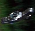
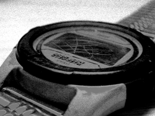
Interesting shot, great that you tried something new, even though the voters didn't seem to appreciate it! I love the graininess of this shot, which complements the scratches on the watch. Perhaps an older style watch might have fit the theme more.. but I love the title by the way! Composition is strong, adding drama to the picture, with good use of DOF. I think that the score doesn't reflect the quality of the shot, just on this site I have realised that over-prossessing doesn't go down well! Good Luck in the next challenge! |
|
 Photographer found comment helpful. Photographer found comment helpful. |
|
|
03/31/2003 06:36:11 PM |
| Jon, seems that your prediction about the low score came true ;-) But I just wanted to let you know that I like the grainy style. There are some areas which seem to have become plain grey with no structure by the postedititing. |
|
| Photographer found comment helpful. |
Comments Made During the Challenge  |
|
|
03/30/2003 03:11:39 AM |
| The scratching on the watch is quite effective. |
|
| Photographer found comment helpful. |
|
|
03/29/2003 01:49:18 PM |
| Not sure why but i like it.7 |
|
|
|
03/28/2003 08:32:14 AM |
| I like the grainy shot. It works with the composition |
|
| Photographer found comment helpful. |
|
|
03/27/2003 04:49:17 PM |
| I love the grain here; it provides a certain drama to the image. You may have pushed some of your levels just a tad too much. Note the patches of pure gray at the lower left. I like the tone of the whole image, though, and the title and beat up watch say a lot together. |
|
| Photographer found comment helpful. |
Home -
Challenges -
Community -
League -
Photos -
Cameras -
Lenses -
Learn -
Help -
Terms of Use -
Privacy -
Top ^
DPChallenge, and website content and design, Copyright © 2001-2026 Challenging Technologies, LLC.
All digital photo copyrights belong to the photographers and may not be used without permission.
Current Server Time: 02/01/2026 12:00:00 PM EST.