| Author | Thread |
|
|
04/02/2003 06:50:33 PM |
Hello from the Critique Club!
Hello crzystarbuckzgrl!
Wow, what a name you have, so hard to type up *laughs*
Let's get down to business :)
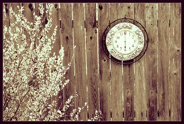
The composition in this photo is just great. Very nicely balanced.. The bush on the left draws the eye to the clock up in the right hand, which works nicely.
The sepia tone seems to fit nicely. Did you try plain black and white? I'm not convinced... I"m not sure what it is. Maybe it's the border which doesn't fit with the way the photo is set up. You want people to believe this is an oldish photograph, and at the same time you add a stark black border, which just doesn't fit.
The lighting seems a little bit harsh, and I think I would have prefered to see more into the clock, although then you might lose the composition you put into it. Ah, I see why you lost detail in the clock. your aperture (the f rating) was a bit too shallow. Did you try around an F6-8? you would have gotten more depth, and you would have had the clock more in focus.
Good luck in the next challenges!
-Annida |
|
Comments Made During the Challenge  |
|
|
03/30/2003 04:55:00 PM |
| I like the texture of this picture. |
|
|
|
03/30/2003 09:21:26 AM |
| Good composition but the photo is just that..a photo...no real interest here. |
|
|
|
03/29/2003 07:04:07 PM |
| Composition is very good; sepia tone seems a bit oversaturated, lessening the impact. |
|
|
|
03/28/2003 10:37:23 AM |
| This is a nioce photo. good subject but the lighting on the branches seem a little bright. i give it an 8 |
|
|
|
03/27/2003 07:47:29 PM |
|
|
|
03/26/2003 04:35:44 AM |
| The sepia works but, IMO, I'd like to see more detail on the clock |
|
 Photographer found comment helpful. Photographer found comment helpful. |
|
|
03/25/2003 08:52:57 PM |
| This could have been even more effective if the clock were more inappropriate to the surroundings, you know what I mean? Like a clock that seemed even more out of place than this one does, because this one seems to be in the style of the surroundings. Just rambling. Nice photo, I like your willingness to violate the conventional. |
|
| Photographer found comment helpful. |
|
|
03/25/2003 01:00:05 PM |
| very cute! Somewhat bright though |
|
|
|
03/25/2003 08:43:11 AM |
| Perhaps a bit overexposed,but I like the tones and contrasts of this image. I love how the bush on the left echoes the tones and feel of the clock. Nice work! |
|
| Photographer found comment helpful. |
|
|
03/25/2003 04:18:18 AM |
| very goodgood composition |
|
|
|
03/24/2003 11:39:14 AM |
| The tone really adds a lot to this photo. The clock in thirds and crop are perfect ! Nice photo ! |
|
| Photographer found comment helpful. |
|
|
03/24/2003 07:11:38 AM |
| Nice idea - a good way to get a little variation on a theme which invites a lot of very same-y pictures. Good sepia tones too; works well. The photo could perhaps do with a little cropping on the left - the bush is distracting the attention a bit away from the 'time' element of the pic. Good shot though 7. |
|
| Photographer found comment helpful. |
|
|
03/24/2003 06:23:21 AM |
| Wonderful old fashioned charm here. The way you have cropped this image with the bush on the left gives this image an excellent balance - 10. |
|
Home -
Challenges -
Community -
League -
Photos -
Cameras -
Lenses -
Learn -
Help -
Terms of Use -
Privacy -
Top ^
DPChallenge, and website content and design, Copyright © 2001-2025 Challenging Technologies, LLC.
All digital photo copyrights belong to the photographers and may not be used without permission.
Current Server Time: 04/08/2025 04:43:59 AM EDT.