| Author | Thread |
|
|
04/04/2003 01:58:16 PM |
Greetings from the Critique Club
By Inspzil
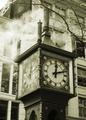
Composition - Color tones are great. They really add a lot to the shot overall. I love the "glowing" leaves on the branches, an equally great effect. This has a 60's look to it I think. The branches work well to show some depth to the pic. My biggest qualm with this pic is that the bottom half of the clock is not really well focused like the top half. Not sure why, but thats how I see it.
Technical - Extremely well taken. Good DOF, exposure is great, just a touch soft on the focus on the clock as I said above. The biggest, best difference in this photo is the remarkable job you did adjusting color, levels and making it unusual in terms of tone, but familiar in an eerie way. Very well done.
Overall - A nice strong image. Not too dynamic, but a soild composition backed by some awesome editing. Very good work! Good luck on your future challenges. - Inspzil |
|
 Photographer found comment helpful. Photographer found comment helpful. |
Comments Made During the Challenge  |
|
|
03/30/2003 11:59:05 PM |
|
| Photographer found comment helpful. |
|
|
03/30/2003 11:03:40 PM |
| Simply wonderful tones here. The sky is fabulous, but what really makes this image effective to me (the frosting on the cake) is the way the lacy branches echo the lettering of the clock. Delightful to look at. High marks from me. |
|
| Photographer found comment helpful. |
|
|
03/30/2003 08:51:48 PM |
| I really like the tones in this shot.. is it a cross between sepia and b&w? I'd like to learn how to do this. |
|
| Photographer found comment helpful. |
|
|
03/30/2003 01:36:10 PM |
|
| Photographer found comment helpful. |
|
|
03/29/2003 11:56:18 PM |
| Very nice shot. Desaturation and tonal range really sets a nice mood. |
|
| Photographer found comment helpful. |
|
|
03/28/2003 09:03:12 AM |
|
| Photographer found comment helpful. |
|
|
03/28/2003 12:46:28 AM |
| nice photo, but not very creative |
|
|
|
03/27/2003 02:44:17 PM |
| I like the use of light in this photo. The subect is very nice. |
|
| Photographer found comment helpful. |
|
|
03/26/2003 07:16:53 PM |
| Very nice composition and use of filter (or coloration). Focus is perfect. The background is also very nicely arranged. Strong 9. Swash |
|
| Photographer found comment helpful. |
|
|
03/25/2003 10:19:06 PM |
| I like this shot but the bottom of the clock is out of sharp focus. It would have had greater focus to shoot it head on instead of from below. Good exposure and a perfect shot for black and white. |
|
| Photographer found comment helpful. |
|
|
03/25/2003 05:55:10 PM |
|
| Photographer found comment helpful. |
|
|
03/25/2003 04:56:26 AM |
|
| Photographer found comment helpful. |
|
|
03/24/2003 10:21:43 PM |
| really neat tonal quality, i would like to have seen the clock a little more to the left. |
|
| Photographer found comment helpful. |
|
|
03/24/2003 05:18:56 PM |
| Moody.....exellent lighting, tones, focus.....yummy shot. Bravo!!!!! Good luck |
|
| Photographer found comment helpful. |
|
|
03/24/2003 11:20:42 AM |
| Nice mellow photo. The branches seem to be in focus more that the clock itself but I like it so much it's worth a 10. |
|
| Photographer found comment helpful. |
Home -
Challenges -
Community -
League -
Photos -
Cameras -
Lenses -
Learn -
Help -
Terms of Use -
Privacy -
Top ^
DPChallenge, and website content and design, Copyright © 2001-2026 Challenging Technologies, LLC.
All digital photo copyrights belong to the photographers and may not be used without permission.
Current Server Time: 02/01/2026 07:42:35 AM EST.