| Author | Thread |
|
|
04/12/2003 09:39:42 AM |
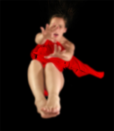
Not a bad shot! I personally think the hands should have been in focus and the rest blurry, that would have been really cool!
~NicNic |
|
Comments Made During the Challenge  |
|
|
03/29/2003 11:54:04 PM |
| Nice idea, I would have liked somewhat more of the picture sharply in focus. |
|
|
|
03/28/2003 06:24:55 PM |
| I personally don't care for photos where nothing is in focus...or at least ALMOST in focus. Perhaps the red could have been closer to focused? Great idea and framing. |
|
|
|
03/27/2003 06:40:22 PM |
|
|
|
03/27/2003 04:03:38 AM |
| This is a great shot, but I just wish that some part of your model was in focus. I think maybe part of the red cloth is, but I would have liked to see either the face or the hands. Still, a very good idea. |
|
|
|
03/26/2003 06:03:33 PM |
| Would like to have seen the terror in the face. |
|
|
|
03/25/2003 07:17:34 PM |
| Good photo, good action, nice everything |
|
|
|
03/25/2003 01:48:56 AM |
| I like this one, very arty and gives a feeling of the person falling, the focus on the cloth is a nice touch, very, very creative, we need more photos like this |
|
|
|
03/24/2003 05:15:25 PM |
| this is a really neat shot... it's one of the first I have seen on DPC where I thought the lack of focus really added a great element to the photo... excellent work... - setzler |
|
|
|
03/24/2003 04:13:20 PM |
| Out of focus intentionally I know, but I don't like the effect in this shot. The shot just doesn't have enough detail to it to be effective, especially as showing or eliciting emotion. Perhaps for a falling effect it would have been better to place your subject towards the top of the frame and allow for negative space at the bottom. Attempts at creativity are always appreciated, but I don't think this one worked out particularly well. 4 |
|
|
|
03/24/2003 04:02:19 PM |
| Something doesn't look right with the red sheet... The middle seems in focus but the edges aren't. It's a pretty cool idea however. Should have had the face more in focus I think. |
|
|
|
03/24/2003 03:49:28 PM |
| it would look more like the person was falling if the red material was not sticking out to the side. i like the originality! |
|
|
|
03/24/2003 03:44:41 PM |
| Oh, it's that nightmare revisited!! You have done a great job on this. Love the red against the black and flesh. I know it's soft in focus, but I really feel it works here. 9 |
|
|
|
03/24/2003 02:27:56 PM |
| Wow, this was beautifully done. I love how some of the red is still in focus. Brilliant. |
|
|
|
03/24/2003 04:28:57 AM |
| Interesting but not too emotional. Could be a lot clearer too. |
|
|
|
03/23/2003 07:48:44 PM |
| I wish it were in better focus, but I like the composition and colors. |
|
|
|
03/23/2003 07:11:05 PM |
| I'd love to know how you did this! 8. (assuming its legal) |
|
Home -
Challenges -
Community -
League -
Photos -
Cameras -
Lenses -
Learn -
Help -
Terms of Use -
Privacy -
Top ^
DPChallenge, and website content and design, Copyright © 2001-2025 Challenging Technologies, LLC.
All digital photo copyrights belong to the photographers and may not be used without permission.
Current Server Time: 04/07/2025 01:26:02 AM EDT.