| Author | Thread |
Comments Made During the Challenge  |
|
|
03/08/2005 06:02:10 AM |
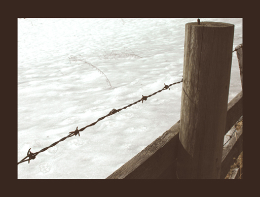
| seems to me a bit more contrast would help this shot a lot. I like the use of the thick border! |
|
 Photographer found comment helpful. Photographer found comment helpful. |
|
|
03/07/2005 10:01:02 AM |
| tip. dont use a black border where the key colour is white.. doesnt help. |
|
|
|
03/06/2005 06:01:59 PM |
| Fine shot, but the lack of burning in on the fence and the big bad border will hurt what is in essence a nice shot. |
|
| Photographer found comment helpful. |
|
|
03/04/2005 06:00:05 AM |
| the border totally spoils this one. still 6 |
|
| Photographer found comment helpful. |
|
|
03/03/2005 12:13:01 PM |
| the thick black border just doen't go whith the challenge spirit. OTOH is a little too small |
|
| Photographer found comment helpful. |
|
|
03/03/2005 07:38:51 AM |
| I don't see any light colors |
|
|
|
03/03/2005 12:24:33 AM |
| There is some interesting details but generaly feels too much frame and too little of picture. |
|
| Photographer found comment helpful. |
|
|
03/02/2005 03:17:42 PM |
| Whit BG and a dark colored sub. |
|
|
|
03/02/2005 11:08:40 AM |
| ruined by unnecessary heavy black border |
|
| Photographer found comment helpful. |
|
|
03/01/2005 07:42:01 PM |
| for a "light on White" challenge I think a different border would be prudent. |
|
| Photographer found comment helpful. |
Home -
Challenges -
Community -
League -
Photos -
Cameras -
Lenses -
Learn -
Help -
Terms of Use -
Privacy -
Top ^
DPChallenge, and website content and design, Copyright © 2001-2025 Challenging Technologies, LLC.
All digital photo copyrights belong to the photographers and may not be used without permission.
Current Server Time: 04/07/2025 01:35:29 AM EDT.