| Author | Thread |
Comments Made During the Challenge  |
|
|
03/06/2005 10:55:43 PM |
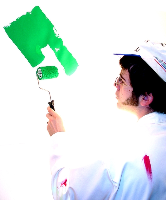
| Great idea and really good composition. Unfortunately I fear that you will be marked down by many because some of the highlights (eg: the subject's Shirt) are overexposed. The challenge guidelines stated to be mindful of this. I like it though, good work! |
|
 Photographer found comment helpful. Photographer found comment helpful. |
|
|
03/06/2005 04:47:36 PM |
|
| Photographer found comment helpful. |
|
|
03/03/2005 06:07:42 PM |
| Wish the arm and shoulder weren' t blown out, but like this idea. |
|
| Photographer found comment helpful. |
|
|
03/03/2005 04:21:06 PM |
| the arm is a bit washed out, but I love the idea. 7 |
|
| Photographer found comment helpful. |
|
|
03/03/2005 11:29:37 AM |
| I think the green on the wall draws the attention away from what the subject should be, the painter in the light suit. Although, it is a farely light shade of green, so I am not voting you down for that, just thought I should state my opinion. |
|
| Photographer found comment helpful. |
|
|
03/02/2005 11:07:34 AM |
| Hightlights on the model are blown. |
|
| Photographer found comment helpful. |
Home -
Challenges -
Community -
League -
Photos -
Cameras -
Lenses -
Learn -
Help -
Terms of Use -
Privacy -
Top ^
DPChallenge, and website content and design, Copyright © 2001-2025 Challenging Technologies, LLC.
All digital photo copyrights belong to the photographers and may not be used without permission.
Current Server Time: 04/07/2025 02:42:59 PM EDT.