| Author | Thread |
Comments Made During the Challenge  |
|
|
03/04/2005 04:23:59 PM |
| Very polished and well executed. |
|
 Photographer found comment helpful. Photographer found comment helpful. |
|
|
03/04/2005 11:34:15 AM |
This will simply winn this contest 10+++
idea 10
photo 10
text 10 |
|
| Photographer found comment helpful. |
|
|
03/04/2005 10:54:22 AM |
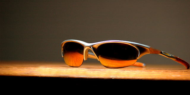
A couple of things:
1. Nice reflection on the glasses and richness of tone.
2. The crop is unfortunate. You could have enlarged the shades in the frame and cropped out the intrusive black area at the bottom. This would then leave the glasses as 'hero' and leave just enough space for minimal text and logo. As it stands, the first thing you're aware of is the table edge.
3. shot is a touch noisy. You could try running it through neat Image (or equivalent) or converting to lab color mode in Photoshop and blurring the channels 'a' and 'b' until the noise is reduced. This leaves the definition (Lightness channel) intact.
And lastly, Oakleys are unfortunately terribly made!! If you look at the stems you'll probablly notice some poor spraying. They're WAY over-priced compared to some much better brands (Adidas, RayBan) for equivalent outlay. |
|
| Photographer found comment helpful. |
|
|
03/02/2005 02:55:42 PM |
| your wonderfully simplistic approach would work even better if the table surface was plain, and if you hadn't included that distracting front edge. |
|
| Photographer found comment helpful. |
|
|
03/01/2005 02:40:20 PM |
|
| Photographer found comment helpful. |
|
|
02/28/2005 02:50:48 PM |
ok, i am voting this challenge in 2 passes. in this pass, you will get a partial comment and a score. then i will come back to comment again. if you have any problem whatsoever with this comment, pm me and let me know. otherwise, take it with a grain of salt...i'm not trying to be a know-it-all, i'm just explaining where i'm coming from in voting this challenge. and, if this comment is NOT helpful (of if you think i'm full of $#!+), don't mark it helpful.
billboards are a science unto themselves. a lot of research has gone into determining just how much information a person can digest and retain in specific time spans. they use this information to develop formulas for determining the number of words and letters to use on billboards, as well as their sizes. they also determine the size and number of visual elements to include.
the graphics/photograph on a billboard are designed to get the point across in a moment. on the road, a driver will have less time with a billboard than a voter will give your image. this is a key element in the challenge: composing a shot that will get its point across quickly and succintly. along those lines, a strong composition will probably have few details and make strong use of negative space. |
|
| Photographer found comment helpful. |
|
|
02/28/2005 08:09:15 AM |
| Great execution. The design and the use of dof is well done. My only nit pik would be that the reflection could have been much more interesting. nice job.8 |
|
| Photographer found comment helpful. |
|
|
02/28/2005 03:33:53 AM |
| GREAT composition. The lighting and color adds major impact ! |
|
| Photographer found comment helpful. |
|
|
02/28/2005 01:20:59 AM |
| wish that dark edge wasn't there at the bottom, and just the tiniest bit of the arm of the glasses is cut off. otherwise, i quite enjoy this |
|
| Photographer found comment helpful. |
Home -
Challenges -
Community -
League -
Photos -
Cameras -
Lenses -
Learn -
Help -
Terms of Use -
Privacy -
Top ^
DPChallenge, and website content and design, Copyright © 2001-2025 Challenging Technologies, LLC.
All digital photo copyrights belong to the photographers and may not be used without permission.
Current Server Time: 04/07/2025 01:55:52 PM EDT.