| Author | Thread |
Comments Made During the Challenge  |
|
|
03/04/2005 04:26:07 PM |
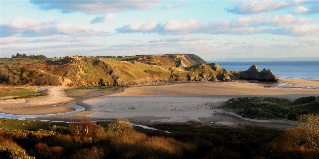
| Love this picture, clouds are a litle blown, but still.. love this pic. |
|
 Photographer found comment helpful. Photographer found comment helpful. |
|
|
03/04/2005 03:39:01 PM |
| Gorgeous landscape. Sky seems a bit overexposed or colors are a bit off, but the land colors and light are fantastic! |
|
| Photographer found comment helpful. |
|
|
03/04/2005 03:30:57 PM |
| Perfect scenic landscape to entice and welcome! Great interpretation for the challenge. |
|
| Photographer found comment helpful. |
|
|
03/03/2005 11:20:06 PM |
ok, i am voting this challenge in 2 passes. in this pass, you will get a partial comment and a score. then i will come back to comment again. if you have any problem whatsoever with this comment, pm me and let me know. otherwise, take it with a grain of salt...i'm not trying to be a know-it-all, i'm just explaining where i'm coming from in voting this challenge. and, if this comment is NOT helpful (of if you think i'm full of $#!+), don't mark it helpful.
billboards are a science unto themselves. a lot of research has gone into determining just how much information a person can digest and retain in specific time spans. they use this information to develop formulas for determining the number of words and letters to use on billboards, as well as their sizes. they also determine the size and number of visual elements to include.
the graphics/photograph on a billboard are designed to get the point across in a moment. on the road, a driver will have less time with a billboard than a voter will give your image. this is a key element in the challenge: composing a shot that will get its point across quickly and succintly. along those lines, a strong composition will probably have few details and make strong use of negative space.
----------------
as an image, this is beautiful, and it would probably work very well in a print ad. on a billboard, though, i think it has a bit too much detail to be appreciated, unless it was positioned somewhere where the viewer has ample time to take it in. this is a tough shot to make work on a billboard, especially given the editing constraints of the challenge. good luck! |
|
| Photographer found comment helpful. |
|
|
03/02/2005 10:41:08 PM |
Composition: 7
Technical: 6, I would like this shot a little more without the shadow in the foreground
Appeal: 7
Challenge: 8
Overall Calculated Average Score: 7 |
|
| Photographer found comment helpful. |
|
|
03/01/2005 02:31:20 PM |
| Beautiful scene, nice work. |
|
| Photographer found comment helpful. |
|
|
03/01/2005 01:11:49 PM |
| I like this photo but it looks a bit over-sharpened to me. |
|
| Photographer found comment helpful. |
|
|
02/28/2005 04:08:29 PM |
| Your sky is very light; not much color |
|
| Photographer found comment helpful. |
|
|
02/28/2005 08:26:48 AM |
|
| Photographer found comment helpful. |
Home -
Challenges -
Community -
League -
Photos -
Cameras -
Lenses -
Learn -
Help -
Terms of Use -
Privacy -
Top ^
DPChallenge, and website content and design, Copyright © 2001-2025 Challenging Technologies, LLC.
All digital photo copyrights belong to the photographers and may not be used without permission.
Current Server Time: 04/07/2025 01:58:30 PM EDT.