DPChallenge: A Digital Photography Contest You are not logged in. (log in or register
 
Challenge Entries
Portfolio Images
This image is not part of a public portfolio.
Samick - Dare to Compare
digitalknight


Photograph Information Photographer's Comments
Challenge: Billboard (Advanced Editing IV)
Camera: Nikon D70
Location: Draper Utah
Date: Feb 26, 2005
Aperture: 8.0
ISO: 200
Shutter: 1/60
Galleries: Black and White
Date Uploaded: Feb 27, 2005

Levels
Curves
D&B
USM (lightness channel)

Statistics
Place: 47 out of 148
Avg (all users): 5.9130
Avg (commenters): 8.0000
Avg (participants): 5.9231
Avg (non-participants): 5.9052
Views since voting: 943
Views during voting: 331
Votes: 207
Comments: 9
Favorites: 0


Please log in or register to add your comments!

AuthorThread
 Comments Made During the Challenge
03/04/2005 06:21:53 PM
exceptional use of minimalisim in advertising.
03/04/2005 06:09:02 PM
geat detail with no glare, the shadows of the keys......great job...10
03/03/2005 02:22:13 AM
Composition: 7, Technical: 8, Appeal: 6, Challenge: 8, Overall Calculated Average Score: 7
03/03/2005 01:00:43 AM
ok, i am voting this challenge in 2 passes. in this pass, you will get a partial comment and a score. then i will come back to comment again. if you have any problem whatsoever with this comment, pm me and let me know. otherwise, take it with a grain of salt...i'm not trying to be a know-it-all, i'm just explaining where i'm coming from in voting this challenge. and, if this comment is NOT helpful (of if you think i'm full of $#!+), don't mark it helpful.

billboards are a science unto themselves. a lot of research has gone into determining just how much information a person can digest and retain in specific time spans. they use this information to develop formulas for determining the number of words and letters to use on billboards, as well as their sizes. they also determine the size and number of visual elements to include.

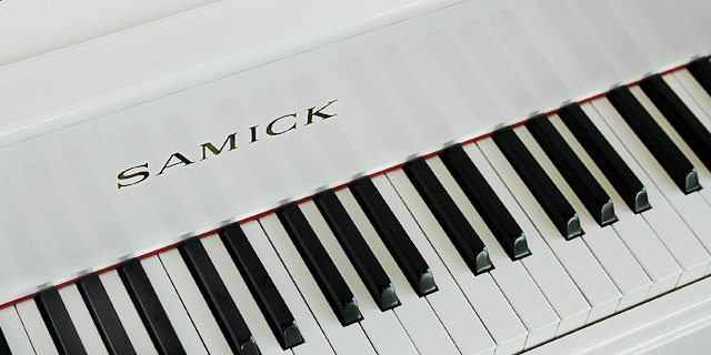
the graphics/photograph on a billboard are designed to get the point across in a moment. on the road, a driver will have less time with a billboard than a voter will give your image. this is a key element in the challenge: composing a shot that will get its point across quickly and succintly. along those lines, a strong composition will probably have few details and make strong use of negative space.
---------------------
nice idea for a billboard! love the simplicity of colors and lines. as is, though, not too sure how it would come across at a distance as the font on the name is fairly light and small. all the same, this is a good job, and i hope it does well for you. good luck!
03/02/2005 11:43:22 AM
Hey! I also own a Samick! Nice shot
03/01/2005 03:28:07 PM
Like how you zoomed in and cropped it. Lighting is a lttle flat to my eye, but, otherwise, very concise and effective photo.
03/01/2005 02:40:44 PM
Nice sharp shot
02/28/2005 11:34:05 PM
Nice shot... clean, clear, simple and an appealing angle.
02/27/2005 07:28:25 PM
Fantastic. Great subtle reflections too!


Home - Challenges - Community - League - Photos - Cameras - Lenses - Learn - Help - Terms of Use - Privacy - Top ^
DPChallenge, and website content and design, Copyright © 2001-2025 Challenging Technologies, LLC.
All digital photo copyrights belong to the photographers and may not be used without permission.
Current Server Time: 04/07/2025 01:55:29 PM EDT.