| Author | Thread |
Comments Made During the Challenge  |
|
|
05/12/2002 11:07:00 PM |
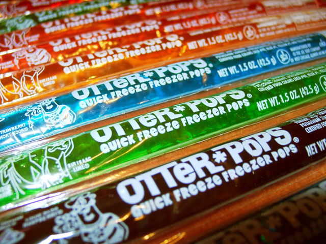
| watch the glare on the packages ... |
|
|
|
05/12/2002 10:43:00 PM |
| Good advertisement, it makes me want some! I think I would have placed the dark color in the back. |
|
|
|
05/12/2002 09:47:00 PM |
| I love the colors in this shot, but I wish the ones closer to us were more vibrant. Maybe lower the lighting to the side so they looked like they were glowing more than reflecting. |
|
|
|
05/12/2002 12:06:00 PM |
| Very colorful. As an ad it would seem you would want a greater depth of field so that all of the products are in focus (though I understand this may not have been your intended effect)? The blown highlights on the left side of the photo should have been avoided with a different lighting effect. Good effort. |
|
|
|
05/11/2002 06:52:00 PM |
| I haven't had one of those in a looonnnng time... |
|
|
|
05/10/2002 05:18:00 PM |
| I would have liked a bit greater depth but thats just personal pref. |
|
|
|
05/09/2002 09:18:00 PM |
| Nice and colorful. I also like the way the eye is drawn upwards and over. I think it would have been better if you had cut/tore the individual ones apart so that it was color to color without the table (?) showing. |
|
|
|
05/09/2002 02:16:00 PM |
| It may have helped if you had put them on a white background. |
|
|
|
05/09/2002 12:11:00 PM |
| if only the one closest to the camera was in focus... |
|
|
|
05/08/2002 04:30:00 PM |
|
|
|
05/08/2002 03:21:00 PM |
| The closest Otter Pop should be brighter like the others. It's a pretty cool picture, though. |
|
|
|
05/08/2002 03:07:00 PM |
| Great colors in this shot. My favorite one ! |
|
|
|
05/08/2002 01:15:00 PM |
| Nice arrangement; however, it is slightly out of focus and the glare along the left side detracts from the picture. Increase depth of field. |
|
|
|
05/08/2002 01:09:00 PM |
| The layout is good, but It looks like your camera blocked some of your light creating a distracting shadow on the bottom/right. |
|
|
|
05/08/2002 12:17:00 PM |
| Mmm I like these pops. Nice setup and and a colorfull picture. The unsharpness at the bottom is kinda disturbing though. |
|
|
|
05/08/2002 08:04:00 AM |
| i like this. i did a pic similar that i didnt enter, wtih batteries. one thing i found effective was to use a big aperature to limit focus to onlyone of the batteries so the rest blurred into the distance. check it out: //www.pbase.com/image/1941284 |
|
|
|
05/07/2002 11:40:00 PM |
| good diagonal lines, bright colours, nice 'abstract' concept |
|
|
|
05/07/2002 08:31:00 PM |
| Close the aperture more (increase the f/number) to make everything in-focus. |
|
|
|
05/07/2002 12:25:00 PM |
| Beautiful! I'm giving this a 9, if the pops continued through the corner, I'd have given it a 10. |
|
|
|
05/07/2002 03:33:00 AM |
| I think it'd be better if they were frozen, maybe a bit of ice and water would have looked cool |
|
|
|
05/07/2002 02:11:00 AM |
| Oooh, pretty colours :) The strong reflections of the lights on the plastic is a bit distracting though. |
|
|
|
05/06/2002 10:31:00 PM |
| nice colors... the lighting could bet better and instead of a wooden table, it would have been great to have a white background (or maybe black), but i like it |
|
|
|
05/06/2002 07:53:00 PM |
| There are never enough blue ones! I love the color here, the bottom right is distracting. I am curious why you decided not to freeze them and have them be all frosty?....8 |
|
|
|
05/06/2002 07:38:00 PM |
| nice arrangement, too much glare |
|
|
|
05/06/2002 07:01:00 PM |
| nice idea and colors, but only the middle of the pic is in focus. |
|
|
|
05/06/2002 05:54:00 PM |
| Oooh we used to get these all the time! The only thing I would change is to make these int he front closer together so you can't see the table under. |
|
|
|
05/06/2002 03:10:00 PM |
| Made from whole otter juice. Nice colors and good shot. |
|
|
|
05/06/2002 01:56:00 PM |
| I like the colors and the composition. Nice work. |
|
|
|
05/06/2002 01:45:00 PM |
| Great color! Did you try angling the products as they cascade away to show the label more consistantly? Photo 9 Advert 9 Creativity 9 total 9 |
|
|
|
05/06/2002 12:40:00 PM |
|
|
|
05/06/2002 11:35:00 AM |
| I want an otter*pop now but the shadow on the first one really takes away from the picture |
|
|
|
05/06/2002 08:28:00 AM |
| I wish the DOF had been more. |
|
|
|
05/06/2002 06:07:00 AM |
|
|
|
05/06/2002 05:14:00 AM |
| Cute. This would stand out more if the focus started with the first item and faded toward the back. As it is, the second pop is more focused. |
|
|
|
05/06/2002 03:49:00 AM |
| This is a nice phot but the light in the lower right corner (or lack of light) makes it look empty. This may have also been better if the pops were pushed together to eliminate the space between them... |
|
|
|
05/06/2002 12:46:00 AM |
| Yummy, but yummier if frozen! |
|
|
|
05/06/2002 04:13:00 PM |
| Very nice. I like the angle, and these just make it interesting because of their colors. |
|
|
|
05/06/2002 04:09:00 PM |
|
Home -
Challenges -
Community -
League -
Photos -
Cameras -
Lenses -
Learn -
Help -
Terms of Use -
Privacy -
Top ^
DPChallenge, and website content and design, Copyright © 2001-2026 Challenging Technologies, LLC.
All digital photo copyrights belong to the photographers and may not be used without permission.
Current Server Time: 02/01/2026 09:58:58 AM EST.