| Author | Thread |
Comments Made During the Challenge  |
|
|
03/07/2005 05:59:59 PM |
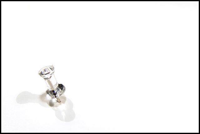
| Great image, but I really don't like the black border. It pulls my attention right out of the picture. |
|
 Photographer found comment helpful. Photographer found comment helpful. |
|
|
03/07/2005 03:35:17 PM |
| I like the shadows and use of negative space. The border seems too heavy and overpowering for this delicate subject |
|
| Photographer found comment helpful. |
|
|
03/06/2005 10:58:07 PM |
| Very Creative. Great use of white space. 9 |
|
| Photographer found comment helpful. |
|
|
03/06/2005 11:32:34 AM |
| very minimalistic, but good idea ... maybe a little bit less contrasty |
|
| Photographer found comment helpful. |
|
|
03/04/2005 02:06:24 PM |
| thats a nice idea!!! very good light!! good luck!!!!!! |
|
| Photographer found comment helpful. |
|
|
03/04/2005 08:04:53 AM |
| original, but not enough subject, too much foreground. 5 |
|
| Photographer found comment helpful. |
|
|
03/04/2005 05:57:37 AM |
| Clever idea! Very simplistic, and original! 9. |
|
| Photographer found comment helpful. |
|
|
03/03/2005 03:59:40 PM |
| Nice shot-good placement of the pin. |
|
| Photographer found comment helpful. |
|
|
03/03/2005 12:51:30 PM |
|
| Photographer found comment helpful. |
|
|
03/02/2005 06:22:33 AM |
| Well, I suppose minimalism can proceed just a bit farther than this; but I'd miss the point. |
|
| Photographer found comment helpful. |
|
|
03/02/2005 05:13:47 AM |
| INteresting refraction of light in the foreground shadow area. |
|
| Photographer found comment helpful. |
|
|
03/01/2005 08:55:49 PM |
| This is such a simple picture but I really like it. 9 |
|
| Photographer found comment helpful. |
Home -
Challenges -
Community -
League -
Photos -
Cameras -
Lenses -
Learn -
Help -
Terms of Use -
Privacy -
Top ^
DPChallenge, and website content and design, Copyright © 2001-2025 Challenging Technologies, LLC.
All digital photo copyrights belong to the photographers and may not be used without permission.
Current Server Time: 04/06/2025 09:14:27 PM EDT.