| Author | Thread |
Comments Made During the Challenge  |
|
|
03/01/2005 05:14:34 PM |
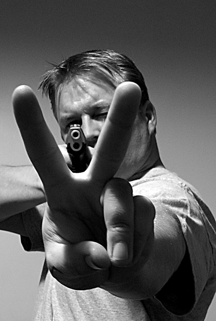
| Loud image, clear message of criticism. Compositionally very nice as well, but the strengths here are more your angle and your content. |
|
|
|
03/01/2005 01:10:22 PM |
| Interesting concept - the weapon aimed from behind the peace sign. Gives it a kind of 'wolf in sheeps clothing' kinda feel. |
|
|
|
02/27/2005 06:03:29 PM |
| In the thumbnail I didn'd see the gun. The impact of opening the photo was an attention getter! Good b&w, too. |
|
|
|
02/25/2005 08:57:15 PM |
| Powerful juxtopositon of opposing 'messages.' |
|
|
|
02/24/2005 05:08:38 PM |
| I love the idea behind this photo. Lighting is good and the way everything lines up is excellent. |
|
|
|
02/24/2005 07:21:34 AM |
| who is this stud? name her looks so tough! hehe |
|
|
|
02/24/2005 06:42:50 AM |
| nice take on the challenge and very strong political message. Without the title the image doesn't really say 70's leaving the viewer to make his own conclusion. Your tones are good and DOF is too, wonder if more light up front on your fingers would have hurt the image any...just a thougt...good luck. |
|
|
|
02/23/2005 06:51:44 PM |
Fantastic interpretation.... This really exemplifies tthe two camps that dominated this time period. I recall the peaceniks, and other forms of demonstration ...and how vietnam war vets were percieved and treated upon their return.
The black and white for me is also reflective of the ideologies of the day.... as most folks on both sides of the issue viewed things in black and white terms only.
My initial score is an 8, but I will most certainly re-visit the one again.\
Great job. |
|
|
|
02/23/2005 05:43:50 PM |
| Great concept...I only wish you had used a more neutral shirt...that one is a little too modern.....but it's a very powerful image. 8 |
|
|
|
02/23/2005 05:27:59 PM |
| How true for the 2000s as well as for the 1970s. This is very good image, technically speaking. I can see what you wanted to refer to with your title, but it is not exclusively '70s issue, so that brings the mark down to 6. |
|
|
|
02/23/2005 11:48:17 AM |
|
|
|
02/23/2005 07:41:04 AM |
| great composition and background. The title has to tie it in with the theme though. 8 |
|
|
|
02/23/2005 02:41:01 AM |
| Like your interpretation. 8. |
|
|
|
02/22/2005 11:44:29 PM |
|
|
|
02/22/2005 07:32:47 PM |
| Interesting idea and execution. I like it! Bet this will do well. |
|
Home -
Challenges -
Community -
League -
Photos -
Cameras -
Lenses -
Learn -
Help -
Terms of Use -
Privacy -
Top ^
DPChallenge, and website content and design, Copyright © 2001-2025 Challenging Technologies, LLC.
All digital photo copyrights belong to the photographers and may not be used without permission.
Current Server Time: 04/07/2025 01:59:20 PM EDT.