| Author | Thread |
Comments Made During the Challenge  |
|
|
03/01/2005 10:20:39 PM |
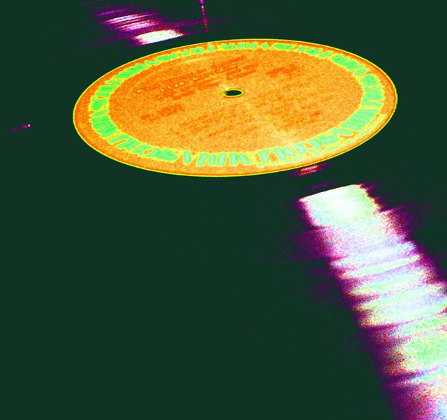
| Your style here effectively transports me a bit. What makes really shoots your score up for me is how much of the 70's look you've conveyed through a subtle and common subject. Other people photographed stuff like this, but this one is unique. Oh, and it only really works up close, I think. |
|
 Photographer found comment helpful. Photographer found comment helpful. |
|
|
02/27/2005 05:29:54 PM |
| Wished that Starlite Vocal Band was legible on the album label. Got one of these somewhere. |
|
| Photographer found comment helpful. |
|
|
02/25/2005 02:22:58 PM |
| Nice how the square format recalls record albums... |
|
| Photographer found comment helpful. |
|
|
02/24/2005 09:03:16 AM |
| I have to assume the oversaturation is purposeful. But not being able to see the rest of the grooves in the record is a problem, especially since this negative space is a wierd and ugly greenish color. |
|
| Photographer found comment helpful. |
|
|
02/24/2005 08:33:23 AM |
| Nice use of colour. Good job. |
|
| Photographer found comment helpful. |
|
|
02/23/2005 12:32:34 PM |
| the reflection hitting the bottom right corner of the frame is great composition, but I don't like what was done to the color. The record lable colors bleed together. 4 |
|
| Photographer found comment helpful. |
Home -
Challenges -
Community -
League -
Photos -
Cameras -
Lenses -
Learn -
Help -
Terms of Use -
Privacy -
Top ^
DPChallenge, and website content and design, Copyright © 2001-2026 Challenging Technologies, LLC.
All digital photo copyrights belong to the photographers and may not be used without permission.
Current Server Time: 02/01/2026 10:23:28 AM EST.