| Author | Thread |
|
|
02/27/2005 07:57:55 PM |
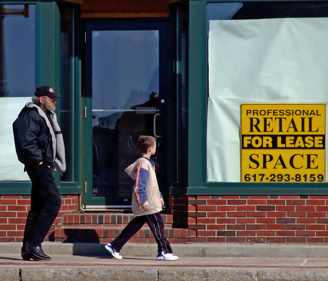
| I read the other comments and don't touch the sign. Maybe tone the color down, but the sign gives the image feeling. Kind of a ageing city or uban decay theme. Papered up windows in a vacant brick building. That is why the bright colors don't work for me. I would expect something a little less cheery and a little more gray. |
|
 Photographer found comment helpful. Photographer found comment helpful. |
Comments Made During the Challenge  |
|
|
02/26/2005 05:44:18 PM |
| A little rich in saturation for my tastes, but I like the idea and layout. |
|
| Photographer found comment helpful. |
|
|
02/22/2005 09:03:00 AM |
| Looks like the work of Jim Konz! |
|
| Photographer found comment helpful. |
|
|
02/20/2005 07:50:41 PM |
| That sign is disturbing! Would have cropped it out! |
|
| Photographer found comment helpful. |
|
|
02/20/2005 07:28:26 PM |
| I like this concept. I think that the yellow sign might have distracted me from looking at the two people at first, so it took me a minute to try and figure the message. The message might be easier to pick out if it were cropped out? |
|
| Photographer found comment helpful. |
|
|
02/20/2005 07:18:13 PM |
| The sign seem to be the main focus of this photo. |
|
| Photographer found comment helpful. |
Home -
Challenges -
Community -
League -
Photos -
Cameras -
Lenses -
Learn -
Help -
Terms of Use -
Privacy -
Top ^
DPChallenge, and website content and design, Copyright © 2001-2025 Challenging Technologies, LLC.
All digital photo copyrights belong to the photographers and may not be used without permission.
Current Server Time: 04/07/2025 10:24:18 PM EDT.