| Author | Thread |
Comments Made During the Challenge  |
|
|
02/08/2005 06:47:31 PM |
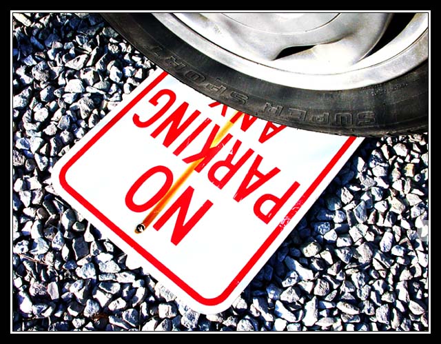
| Love the contrast....I have a feeling this wont get as high as it deserves. |
|
 Photographer found comment helpful. Photographer found comment helpful. |
|
|
02/07/2005 12:01:51 PM |
| Good composition, very ironic, maybe slightly overexposed. |
|
| Photographer found comment helpful. |
|
|
02/05/2005 11:23:25 PM |
| I really like this composition / idea, but it suffers (in my opinion) from way too much sharpness and color distortion on the gravel. I think the image might be improved with levels an/or a little less brightness. But I love the composition. |
|
| Photographer found comment helpful. |
|
|
02/05/2005 07:47:04 PM |
| I like it.. Great idea and excellent composition / excution. My favourite so far... (and I am almost a tthe end!!) Only little thing is it is a shame about the rust line on the sign. |
|
| Photographer found comment helpful. |
|
|
02/05/2005 02:48:10 AM |
| Quite a high-key look here, which works really well. |
|
| Photographer found comment helpful. |
|
|
02/03/2005 06:11:18 AM |
| The contrast is too harsh for me, but for the rest this shot works very well. 9. |
|
| Photographer found comment helpful. |
|
|
02/02/2005 11:58:09 PM |
| This is great, good idea, good exicution, just a tad oversaturated to be at the very top, but should do well. |
|
| Photographer found comment helpful. |
|
|
02/02/2005 10:50:24 PM |
| Don't care for the title much but the composition is very good |
|
| Photographer found comment helpful. |
|
|
02/02/2005 09:30:57 PM |
|
| Photographer found comment helpful. |
|
|
02/02/2005 09:06:04 AM |
|
| Photographer found comment helpful. |
|
|
02/02/2005 08:45:59 AM |
|
| Photographer found comment helpful. |
|
|
02/02/2005 07:29:28 AM |
|
| Photographer found comment helpful. |
|
|
02/02/2005 03:26:45 AM |
|
| Photographer found comment helpful. |
|
|
02/02/2005 02:35:01 AM |
| Ouch way to bright. The high contrast off the rocks and sign makes this photo very hard to look at. Good luck in this challenge. |
|
| Photographer found comment helpful. |