| Author | Thread |
Comments Made During the Challenge  |
|
|
02/07/2005 12:17:59 PM |
| You might have cropped off a little from the bottom. For the rest, it's a nice abstract. 8. |
|
|
|
02/06/2005 02:15:51 AM |
| I like the idea, but i think the crop is a bit too tight or the angle is too forward. |
|
|
|
02/05/2005 10:49:56 PM |
|
|
|
02/04/2005 11:44:14 PM |
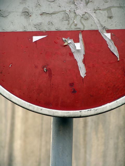
not on this sign, apparently!
this picture stands out due to the fact that it's the only one i've seen so far (rated 67% of images at this point) that is focused solely on the sign and only shows part of it. nice work- it's always nice to see a different take on something. |
|
|
|
02/02/2005 06:13:15 PM |
| Interesting take on the challenge but the clarity leaves a lot to be desired. Its also hard to tell what kind of sign it is and what purpose it has without any surrounding environment. Good luck on this challenge. |
|
|
|
02/02/2005 05:44:09 PM |
| I really like the texture here. I don't know if I would have show so much of the pole though. |
|
Home -
Challenges -
Community -
League -
Photos -
Cameras -
Lenses -
Learn -
Help -
Terms of Use -
Privacy -
Top ^
DPChallenge, and website content and design, Copyright © 2001-2025 Challenging Technologies, LLC.
All digital photo copyrights belong to the photographers and may not be used without permission.
Current Server Time: 04/07/2025 02:39:57 PM EDT.