| Author | Thread |
|
|
04/26/2005 07:39:51 PM |
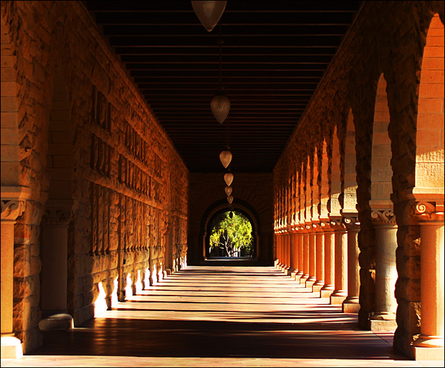
| This is rather a magnificent image.. I like everything about except in the top of the middle hall way where there is a line of lights... THe first one is hard to see, The sun light and shadows is what makes this piece, I assume you used a tripod.. Then you could have used a reflector perhaps... You could clone in another one of them globe lights and it will make a difference. |
|
 Photographer found comment helpful. Photographer found comment helpful. |
|
|
02/07/2005 08:41:31 AM |
Nice light and shadow games. I like this one a lot better then your entry at the lighting challenge.
Just one little comment I do have: try to rotate the picture a tiny bit ccw. Since this is a picture of symmetry, i'd prefer to see it completely horizontal. Well, I'm no professional. This is just my personal opinion.
Overall I think this photo is wonderful! |
|
| Photographer found comment helpful. |
|
|
01/30/2005 11:58:53 PM |
This is a neat setting to try and get those "light" shots. I like the arches, lines and shadows and the texture of the wall. The contrast seems a bit too harsh for me - with the sunlight a bit too washed out against the back wall.
Also, it somehow seems just a bit off center or slanted in the positioning of the camera. I also wish it didn't have the green tree at the end. I would have liked something with less contrast to the brown/golden colors of the walkway. Now, why didn't you move that tree? :) Overall, though, it's a nice shot and a location I think would be fun to try different things with. |
|
| Photographer found comment helpful. |
Home -
Challenges -
Community -
League -
Photos -
Cameras -
Lenses -
Learn -
Help -
Terms of Use -
Privacy -
Top ^
DPChallenge, and website content and design, Copyright © 2001-2026 Challenging Technologies, LLC.
All digital photo copyrights belong to the photographers and may not be used without permission.
Current Server Time: 02/01/2026 08:35:42 AM EST.