| Author | Thread |
Comments Made During the Challenge  |
|
|
02/08/2005 02:04:34 PM |
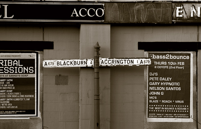
Hello from just up t'road : )
Technically good, but a bit too "flat". I would probably prefer an angled shot, possibly looking up at the sign and taking the focus away from the posters while still featuring them. The sepia treatment was a good idea and works well. |
|
|
|
02/07/2005 08:03:54 AM |
|
|
|
02/05/2005 02:41:38 AM |
| The cropping off of the poster on the left leaves the picture feeling a little unfinished to me. |
|
|
|
02/02/2005 03:08:42 PM |
| I love the contrast of light and dark in this photo. Everything is very clear, great job! |
|
|
|
02/02/2005 04:31:53 AM |
| You must be very close to me here. Good shot. |
|
|
|
02/02/2005 12:46:29 AM |
| Ahh not seen that street for years! |
|
Home -
Challenges -
Community -
League -
Photos -
Cameras -
Lenses -
Learn -
Help -
Terms of Use -
Privacy -
Top ^
DPChallenge, and website content and design, Copyright © 2001-2025 Challenging Technologies, LLC.
All digital photo copyrights belong to the photographers and may not be used without permission.
Current Server Time: 04/09/2025 06:10:26 PM EDT.