| Author | Thread |
Comments Made During the Challenge  |
|
|
01/29/2005 02:33:29 PM |
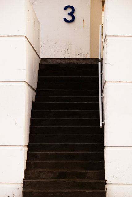
| The only thing I don't like is that it doesn't look level. |
|
|
|
01/28/2005 11:22:02 PM |
| In the available light this image had too wide dynamic range to be captured. The stairs need badly more detail, while the closer walls start to fade into white. The composition is also a bit off, the number is bit tilted and I'm not sure the image benefits of having slight slide of background world showing from the right of the letter. The idea works well, however, so with retake this might be wonderful on it's own right. |
|
 Photographer found comment helpful. Photographer found comment helpful. |
|
|
01/28/2005 02:26:22 PM |
| Very nice, just a little loss of detail in the darker areas, but nice enough - 7 |
|
| Photographer found comment helpful. |
|
|
01/28/2005 01:38:30 PM |
| nice idea but spoiled by the lack of sharpness in the upper steps, the general dirtiness of the building and the distracting glimpse in the top fight hand corner. |
|
| Photographer found comment helpful. |
|
|
01/28/2005 02:13:20 AM |
| I like it. I think it would have been better if you has stepped a tad bit to the right so that you don't see that little gap up there. Now the eye becomes curious and moves away from the 3. But I definitely like this shot much better than all the 3 objects with a white or black background. |
|
| Photographer found comment helpful. |
Home -
Challenges -
Community -
League -
Photos -
Cameras -
Lenses -
Learn -
Help -
Terms of Use -
Privacy -
Top ^
DPChallenge, and website content and design, Copyright © 2001-2025 Challenging Technologies, LLC.
All digital photo copyrights belong to the photographers and may not be used without permission.
Current Server Time: 04/07/2025 01:35:13 PM EDT.