| Author | Thread |
Comments Made During the Challenge  |
|
|
02/02/2005 11:20:27 PM |
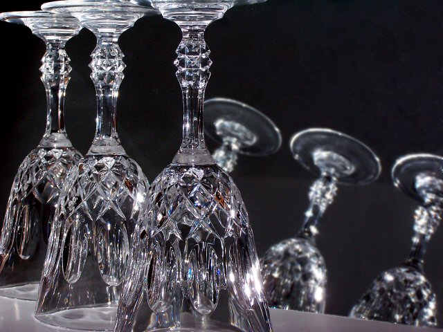
| good lighting. I dont like the fact that there are 3 other glasses in the back (breaks the theme) and the dual tone background plus the table on the foreground glasses is not a good idea and breaks the overall tone of the shot. 4. |
|
|
|
01/29/2005 02:26:15 PM |
| The dark reflections in the glass are distracting. Remove those and I think you have an excellent shot. |
|
 Photographer found comment helpful. Photographer found comment helpful. |
|
|
01/29/2005 07:01:57 AM |
| That's 6 :).. Serious.u, though, the top of the front glass getting cropped off isn't that fun. Also the lighting is a little flat for all the details in the glass. And the three at the back are really very distracting, since their angle is not harmonious at all, and they are out of focus, etc etc. Basically they are unnecessary, and being Advanced Editing, it could be cloned out. |
|
| Photographer found comment helpful. |
|
|
01/29/2005 05:51:05 AM |
| There was another glass theme too, but this one gives more to the eye to look at. I'm not sure how to react to the recurring three glasses, but they're out of focus so perhaps they're just to provide some background. Caustics on the "floor" beneath the glasses are nice, as well as the sparkles at the right side of the biggest glass. The line separating the repeating glasses is horrible, and I'm totally at loss what's the meaning of it. |
|
| Photographer found comment helpful. |
Home -
Challenges -
Community -
League -
Photos -
Cameras -
Lenses -
Learn -
Help -
Terms of Use -
Privacy -
Top ^
DPChallenge, and website content and design, Copyright © 2001-2025 Challenging Technologies, LLC.
All digital photo copyrights belong to the photographers and may not be used without permission.
Current Server Time: 04/07/2025 01:46:47 AM EDT.