| Author | Thread |
|
|
02/02/2005 11:48:40 AM |
| nice work! that was one of my favorite finds when i was visiting out there about 15 years ago. |
|
 Photographer found comment helpful. Photographer found comment helpful. |
Comments Made During the Challenge  |
|
|
02/01/2005 11:22:55 PM |
|
| Photographer found comment helpful. |
|
|
01/31/2005 10:37:12 PM |
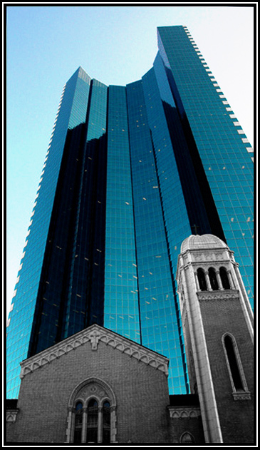
| i felt you should show more of the church |
|
| Photographer found comment helpful. |
|
|
01/31/2005 12:14:30 PM |
|
| Photographer found comment helpful. |
|
|
01/31/2005 12:07:52 AM |
|
| Photographer found comment helpful. |
|
|
01/30/2005 08:45:47 AM |
| I would levae more space on the right, the side of the church could start from the right bottom corner. I wouldn't have deaturated the church, what colour it was? Grey? Brown? Red? Yellow? I think it would have worked well with the blues, but maybe I am mistaken. Composition is great! :-) The view, too. :-) |
|
| Photographer found comment helpful. |
|
|
01/29/2005 01:01:34 PM |
| At first I thought the lights in the offices were a bit distracting but then I see it gives the photo more of a reality, love the angle and the way the church blends in... |
|
| Photographer found comment helpful. |
|
|
01/28/2005 12:10:29 AM |
| Wow, quite a powerful image with those strong verticals towering over the older structures. Good job 8 |
|
| Photographer found comment helpful. |
|
|
01/27/2005 08:31:17 PM |
| this looks strangely familiar...this looks like a bccutter original, but then, i've been known to be wrong before. |
|
| Photographer found comment helpful. |
|
|
01/27/2005 07:57:29 PM |
| This is amazing, I love the view in which this was shot, it really shows the contrast between the two, congrats on a great capture! 9 |
|
| Photographer found comment helpful. |
|
|
01/27/2005 06:22:37 PM |
| Almost feels like a photoshop superimposed building. I'm sure it isn't |
|
| Photographer found comment helpful. |
|
|
01/27/2005 05:39:01 PM |
|
| Photographer found comment helpful. |
|
|
01/27/2005 08:12:09 AM |
|
| Photographer found comment helpful. |
|
|
01/27/2005 04:58:54 AM |
| Well done with half desaturation... like the blue of skyscraper... I would choose something more simple for border. |
|
| Photographer found comment helpful. |
|
|
01/26/2005 08:11:19 PM |
| How'd you do that? I want to know but other wise it is very creative and unique! |
|
| Photographer found comment helpful. |
|
|
01/26/2005 06:55:26 PM |
| This is basic editing??? Looks like the church is desaturated. |
|
|
|
01/26/2005 04:21:32 PM |
| very good the contrasts between the colors of the church and the skyscraper. fine composition |
|
| Photographer found comment helpful. |
Home -
Challenges -
Community -
League -
Photos -
Cameras -
Lenses -
Learn -
Help -
Terms of Use -
Privacy -
Top ^
DPChallenge, and website content and design, Copyright © 2001-2026 Challenging Technologies, LLC.
All digital photo copyrights belong to the photographers and may not be used without permission.
Current Server Time: 02/01/2026 09:30:33 AM EST.