| Author | Thread |
Comments Made During the Challenge  |
|
|
01/31/2005 10:01:10 AM |
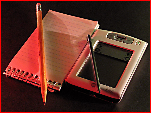
| The red and the red border I think is too much. |
|
 Photographer found comment helpful. Photographer found comment helpful. |
|
|
01/30/2005 05:32:37 AM |
| Looks like effort was put into getting the pencil / pen angles just right. A little USM and a little less red tone would've been nice, but this is a nice composition anyway. 6 |
|
| Photographer found comment helpful. |
|
|
01/29/2005 11:33:38 PM |
| Great composition, wonder how many of those paper pads you need to equal the new one? Would have been fun to see a stack though...sorry just me thinking out loud....love the photo |
|
| Photographer found comment helpful. |
|
|
01/29/2005 08:32:13 AM |
| too red and a downward position would suit it better |
|
| Photographer found comment helpful. |
|
|
01/27/2005 08:38:51 AM |
great (com)position(ing)
great found
too bad the technical aspects are far behind |
|
|
|
01/26/2005 06:49:15 PM |
| One of the ideas I had but didn't try. Good shot - I'd prefer a borderless image, however. |
|
| Photographer found comment helpful. |
|
|
01/26/2005 06:39:32 AM |
|
| Photographer found comment helpful. |
|
|
01/26/2005 01:44:49 AM |
| I would like this picture a lot more if there was only one light source. The interfering shadows messes up the image for me. Still, I give it a 7. |
|
| Photographer found comment helpful. |
|
|
01/25/2005 08:50:54 PM |
| I don't like the shining of the red light. Also, maybe it would've been better with a lighter background. |
|
| Photographer found comment helpful. |
Home -
Challenges -
Community -
League -
Photos -
Cameras -
Lenses -
Learn -
Help -
Terms of Use -
Privacy -
Top ^
DPChallenge, and website content and design, Copyright © 2001-2025 Challenging Technologies, LLC.
All digital photo copyrights belong to the photographers and may not be used without permission.
Current Server Time: 04/08/2025 05:02:10 AM EDT.