| Author | Thread |
|
|
02/02/2005 04:31:24 AM |
| I wanted to thank everyone for your comments, I am learning slowly but surely and your comments do help! |
|
Comments Made During the Challenge  |
|
|
01/31/2005 02:17:23 PM |
|
|
|
01/30/2005 06:41:57 PM |
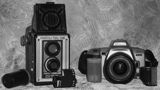
| I think the contrast of old and new is good but to be blunt, a little uninteresting. I think your choice of background is too distracting with all the textures. Maybe if you have moved the cameras away and used a shallow DOF to blur it, it would have been better. As it is, it reflects the flash in a distracting way. I like that you've placed the film canisters around the foreground for interest, but shouldn't the ones in front of the Spartus have been 120's [ not knocking you for that ;) ]. I'm giving this image a 5. |
|
 Photographer found comment helpful. Photographer found comment helpful. |
|
|
01/30/2005 04:54:01 PM |
| Great! i wanted to do something like this, but didn't have any old film camera. The background has a vintage feel as well. Nicely done. |
|
| Photographer found comment helpful. |
|
|
01/28/2005 01:24:04 PM |
Looks like old and older to me..... :)
|
|
|
|
01/28/2005 12:33:57 AM |
| The B/W help with the juxtaposition, I would prefer a more neutral back cloth as this is rather busy |
|
| Photographer found comment helpful. |
|
|
01/27/2005 05:58:15 PM |
| This picture completely lacks creativity. It is simply a literal presentation needed to fulfil the challenge requirements and that is all. Both cameras are displayed equally whereas the older model is far more interesting and should have been more of a focal point. The damask background does not fit in at all and is very distracting and is not smoothed out. This creates wrinkles which I noticed right away. Both camera lenses have flash flares and the Minolta body moreso. When I do not see any creativity in an image I tend to focus on the technical and that is not the purpose of a photo competition. I would suggest that you sell the sizzle and not the steak. In this case, the shot has no sizzle whatsoever and the steak is tough to digest. |
|
| Photographer found comment helpful. |
|
|
01/26/2005 05:45:35 AM |
| The flash is kind of unecesary and makes this shot seem dull, the background... well it does have an interesting tecture but I have to say it doesn't fit the subject very well, as for the B&W, I don't see why you used it here. But well it does meet the challenge. |
|
|
|
01/26/2005 03:51:43 AM |
| need a less distracting backround |
|
Home -
Challenges -
Community -
League -
Photos -
Cameras -
Lenses -
Learn -
Help -
Terms of Use -
Privacy -
Top ^
DPChallenge, and website content and design, Copyright © 2001-2025 Challenging Technologies, LLC.
All digital photo copyrights belong to the photographers and may not be used without permission.
Current Server Time: 04/07/2025 01:38:38 AM EDT.