| Author | Thread |
Comments Made During the Challenge  |
|
|
01/21/2005 06:28:06 PM |
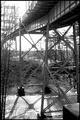
| Great exposure and colors. A higher vantage point would be useful if such exists. A 7. |
|
 Photographer found comment helpful. Photographer found comment helpful. |
|
|
01/21/2005 07:50:17 AM |
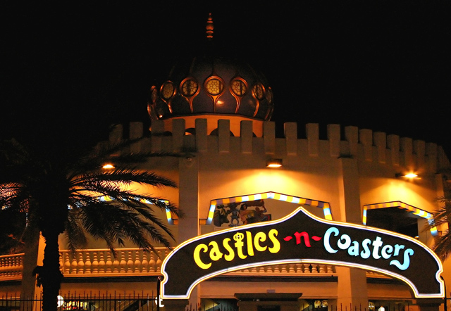
| Your main subject is too dark... My eyes went straight to the sign, which is not so impressive for architecture! |
|
| Photographer found comment helpful. |
|
|
01/19/2005 06:44:42 PM |
| It's an arresting shot, but doesn't say much to me about the architecture. Of course, in this case there's perhaps not much to say. 5. |
|
| Photographer found comment helpful. |
|
|
01/17/2005 09:36:19 AM |
An obvious example of a 10 if ever there was one.
The colors, the composition and the use of dark; it looks better than it ever does in broad dailight! |
|
| Photographer found comment helpful. |
Home -
Challenges -
Community -
League -
Photos -
Cameras -
Lenses -
Learn -
Help -
Terms of Use -
Privacy -
Top ^
DPChallenge, and website content and design, Copyright © 2001-2025 Challenging Technologies, LLC.
All digital photo copyrights belong to the photographers and may not be used without permission.
Current Server Time: 04/07/2025 01:25:29 PM EDT.