| Author | Thread |
Comments Made During the Challenge  |
|
|
01/18/2005 07:31:56 AM |
|
 Photographer found comment helpful. Photographer found comment helpful. |
|
|
01/17/2005 05:16:52 PM |
Returning for comments:
Impetuousity to rip it open and stop the darn thing. |
|
| Photographer found comment helpful. |
|
|
01/16/2005 11:19:55 AM |
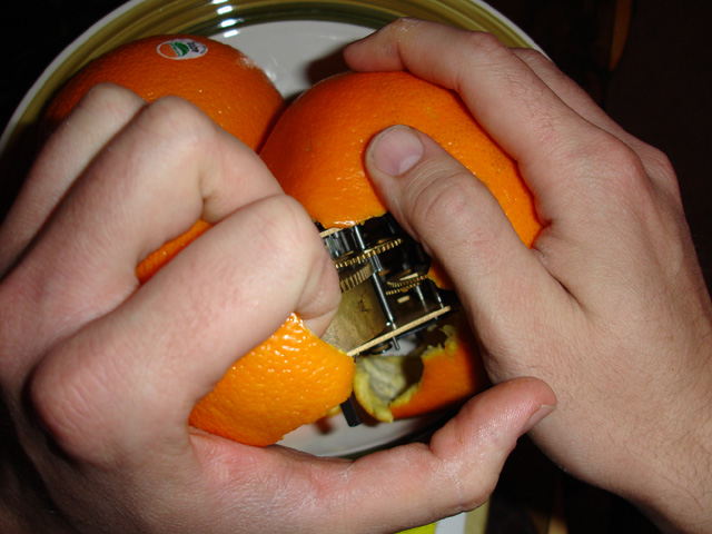
| Welcome to the CWO club :). I like the dynamic in your picture, there's some action in it, your shot shows how the orange is torn apart and reveals it's inside mechanics. The only thing that doesn't work for me is the lighting, it creates some distracting shadows. A cool thing to bring in would have been a small light source INSIDE the orange, within the mechanics. It would have given the picture some extra wow-effect. 7. |
|
| Photographer found comment helpful. |
|
|
01/14/2005 12:33:43 AM |
| the 7th clockwork orange. my god, im tired. |
|
| Photographer found comment helpful. |
|
|
01/13/2005 09:40:42 PM |
|
| Photographer found comment helpful. |
|
|
01/13/2005 03:15:13 PM |
| The idea is neat, but your lighting is (forgive my bluntness) dreadful. Head-on lihgt, or on-borad flash, however soft, simply serves to make the objects nearest the camera the brightest, and thus the most attention-grabbbing: here, the hands. But the point of your image, surely, is the clockwork - yet half of it is shadowed, it forms barely 10% of the image, there's no sense of texture to it, it's hard to focus on without the eye being drawn to the left-most hand (no co-incidence that that's the brightest thing in frame). MMy attention is pulled between the hand that's in focus on the right, and the brighter hand on the left, and it's only by an effort of will that my eye moves to either the orange or the clockwork, and that doesn't make for an effective image. |
|
| Photographer found comment helpful. |
|
|
01/13/2005 11:13:58 AM |
| Very creative :) Lighting could've been better to eliminate harsh shadows. |
|
| Photographer found comment helpful. |
|
|
01/13/2005 10:12:00 AM |
| one of many ... well done, though |
|
| Photographer found comment helpful. |
|
|
01/12/2005 11:28:49 AM |
| I'd like to see more of the orange and the clock mechanism, with possibly less of the guy's hands - maybe just the fingertips or something. I think that would help the color orange a lot. |
|
| Photographer found comment helpful. |
|
|
01/12/2005 05:06:17 AM |
|
| Photographer found comment helpful. |
|
|
01/12/2005 04:56:25 AM |
| The idea is great, but not the execution...If the lighting weren't so harsh, the composition not so arbitrary, and maybe if you had the orange by itself, the innards exposed just a bit, then it might make for more interesting photography. I really think the idea, though, of all the clockwork oranges... I'm still gonna give you a 7 for effort. |
|
| Photographer found comment helpful. |
|
|
01/12/2005 01:58:29 AM |
| Several Clockwork Orange pictures in the competition, this is the best I've seen so far... |
|
| Photographer found comment helpful. |
|
|
01/11/2005 09:14:07 PM |
| I like the concept. The lighting makes it look a little 'snapshotty' though. |
|
| Photographer found comment helpful. |
Home -
Challenges -
Community -
League -
Photos -
Cameras -
Lenses -
Learn -
Help -
Terms of Use -
Privacy -
Top ^
DPChallenge, and website content and design, Copyright © 2001-2025 Challenging Technologies, LLC.
All digital photo copyrights belong to the photographers and may not be used without permission.
Current Server Time: 04/06/2025 10:43:46 PM EDT.