| Author | Thread |
Comments Made During the Challenge  |
|
|
01/16/2005 03:52:39 PM |
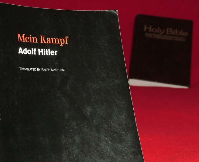
| One of the more interesting submissions. Since the subjects are so flat (being books) I think that more dramatic lighting would have helped a lot. Interesting juxtaposition, and good title. |
|
|
|
01/14/2005 01:06:30 PM |
| Not certain what the message is here. I can guess the intent, but with this material - it should be demonstrated more clearly. Don't like not seeing the right edge of the Bible, it looks like it's sinking. |
|
 Photographer found comment helpful. Photographer found comment helpful. |
|
|
01/11/2005 06:03:40 PM |
| not sure where you were going w/ this one, maybe im just mis-interpreting it |
|
| Photographer found comment helpful. |
|
|
01/11/2005 05:55:36 AM |
|
| Photographer found comment helpful. |
|
|
01/10/2005 11:28:03 AM |
Nice idea about the two contrasting...
I dont like the red tho, maybe a white would look better with more light on the Bible? |
|
| Photographer found comment helpful. |
|
|
01/10/2005 05:56:36 AM |
|
| Photographer found comment helpful. |
|
|
01/09/2005 09:15:10 PM |
| not exactly bokeh =( - outside the context of the challenge though, this certainly has the potential to be a strong image |
|
| Photographer found comment helpful. |
Home -
Challenges -
Community -
League -
Photos -
Cameras -
Lenses -
Learn -
Help -
Terms of Use -
Privacy -
Top ^
DPChallenge, and website content and design, Copyright © 2001-2025 Challenging Technologies, LLC.
All digital photo copyrights belong to the photographers and may not be used without permission.
Current Server Time: 04/07/2025 01:09:51 PM EDT.