| Author | Thread |
Comments Made During the Challenge  |
|
|
01/11/2005 12:18:53 PM |
| you weren't even trying now were you? |
|
 Photographer found comment helpful. Photographer found comment helpful. |
|
|
01/11/2005 05:04:15 AM |
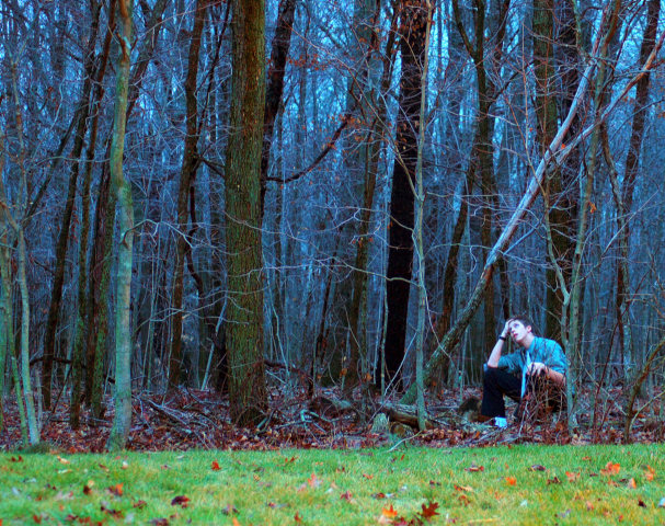
| Your photograph seems to be over saturated and sharpened. IMO Waldo stands out a bit to much. Lighting OK and I think it would of looked better if you would of brought your horizon [grass edge] up to the third line and level, its on a slight tilt. And I wonder if it would of looked better in B&W since you are conveying mood here. With that said, it is a good picture. |
|
| Photographer found comment helpful. |
|
|
01/08/2005 05:32:49 PM |
| Wow, GREAT colours, but I just wish he was a little more hidden. |
|
| Photographer found comment helpful. |
|
|
01/05/2005 03:13:36 PM |
| It's probably just me, but this photo seems a little too saturated. "Waldo" is not really hidden here, is he? |
|
| Photographer found comment helpful. |
|
|
01/05/2005 08:16:48 AM |
|
| Photographer found comment helpful. |
|
|
01/05/2005 03:05:56 AM |
| Lovely colour. Maybe the figure is too large in the frame. |
|
| Photographer found comment helpful. |
|
|
01/04/2005 08:32:26 PM |
| Off the theme. He's right out front! |
|
| Photographer found comment helpful. |
Home -
Challenges -
Community -
League -
Photos -
Cameras -
Lenses -
Learn -
Help -
Terms of Use -
Privacy -
Top ^
DPChallenge, and website content and design, Copyright © 2001-2025 Challenging Technologies, LLC.
All digital photo copyrights belong to the photographers and may not be used without permission.
Current Server Time: 04/07/2025 09:22:26 PM EDT.