| Author | Thread |
Comments Made During the Challenge  |
|
|
01/11/2005 06:42:46 PM |
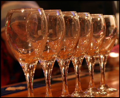
| This is a really neat setup. I've had shots like this where I decided to go black and white, but in this case, I'm not sure you didn't choose the better option. The blue of the hat provides a subtle amount of complimentary color that I like...unfortunately, it also helps to give "Waldo" away, but that's "Waldo's" loss, huh? |
|
 Photographer found comment helpful. Photographer found comment helpful. |
|
|
01/11/2005 12:13:17 PM |
| bad execution of a decent idea |
|
| Photographer found comment helpful. |
|
|
01/11/2005 11:18:15 AM |
Returning for comments:
See him behind this cool glass shot. Bumping up. |
|
| Photographer found comment helpful. |
|
|
01/11/2005 08:46:15 AM |
|
| Photographer found comment helpful. |
|
|
01/11/2005 03:28:26 AM |
| Good picture but a little small. Focas a bit soft. |
|
| Photographer found comment helpful. |
|
|
01/10/2005 09:57:31 AM |
|
| Photographer found comment helpful. |
|
|
01/07/2005 06:19:05 PM |
|
| Photographer found comment helpful. |
|
|
01/05/2005 03:07:54 PM |
| I'd have liked it if the photo weren't tilted... Original idea. Maybe you could have played with the white balance a little more? |
|
| Photographer found comment helpful. |
|
|
01/04/2005 07:12:33 PM |
| to small. i don´t like the colors, good idea |
|
| Photographer found comment helpful. |
Home -
Challenges -
Community -
League -
Photos -
Cameras -
Lenses -
Learn -
Help -
Terms of Use -
Privacy -
Top ^
DPChallenge, and website content and design, Copyright © 2001-2025 Challenging Technologies, LLC.
All digital photo copyrights belong to the photographers and may not be used without permission.
Current Server Time: 04/07/2025 09:08:33 PM EDT.