| Author | Thread |
Comments Made During the Challenge  |
|
|
01/10/2005 09:00:15 AM |
I don't understand your choice of the title. Do you refer to the books in the back?
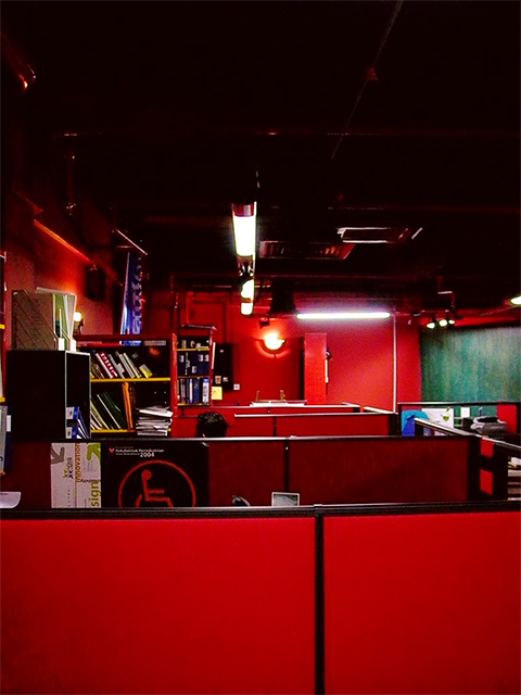
I like the b´vibrant red, you might have brightened it a little. The picture is also tilted, a straight 'horizon' would have been more harmonic. Your person is well hidden, blends in with the surrounding details. 5. |
|
|
|
01/10/2005 03:22:36 AM |
| A great idea, but it seems a little too cluttered on the left hand side. |
|
|
|
01/08/2005 10:44:27 PM |
| Great colours! Seems kinda Matrixy. |
|
|
|
01/08/2005 04:11:55 AM |
|
|
|
01/06/2005 06:23:14 AM |
|
|
|
01/05/2005 10:29:48 PM |
| Nice color and composition. Well done. |
|
|
|
01/05/2005 09:07:25 PM |
| the massive read wall in the forground and the pure black at the top is very distracting |
|
|
|
01/05/2005 03:21:42 PM |
| don't like the colours.. too many |
|
|
|
01/05/2005 01:25:23 PM |
| I think I see Waldo (the black head in the second cubicle?). The red color is great, and the title is good, but for some reason - maybe the lights that glow - this doesn't do much for me. Disclaimer: I am a crappy photographer, so don't take it personally - I'm just going on the assumption that we all want to get comments :-) |
|
Home -
Challenges -
Community -
League -
Photos -
Cameras -
Lenses -
Learn -
Help -
Terms of Use -
Privacy -
Top ^
DPChallenge, and website content and design, Copyright © 2001-2026 Challenging Technologies, LLC.
All digital photo copyrights belong to the photographers and may not be used without permission.
Current Server Time: 02/01/2026 08:24:40 AM EST.