| Author | Thread |
|
|
01/05/2005 03:34:07 AM |
I rated this pretty highly.
Expected to see it among the top twenty. |
|
 Photographer found comment helpful. Photographer found comment helpful. |
Comments Made During the Challenge  |
|
|
01/04/2005 04:15:41 AM |
|
| Photographer found comment helpful. |
|
|
01/03/2005 12:58:59 PM |
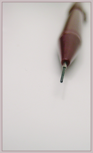
| Without the title, this image doesn't share much information about the object. Perhaps a line or word would clue the viewer in and result in a more engaging image. |
|
|
|
01/03/2005 10:13:31 AM |
| The focus on this one is really quite astounding, and I like your color choice for the border too. |
|
| Photographer found comment helpful. |
|
|
01/02/2005 04:59:15 PM |
| Nice treatment. Could appear closer to the center?... Nice editing! Good Work! |
|
| Photographer found comment helpful. |
|
|
01/02/2005 01:23:46 PM |
| NIce idea. I like using the negative space. Certainly fits the challenge well. But IMO it needs a deeper dof to show more of the pencil. Also, i think if the pencil were not quite so far in the corner, it would balance out a little stronger. |
|
| Photographer found comment helpful. |
|
|
01/01/2005 07:11:47 PM |
|
| Photographer found comment helpful. |
|
|
12/31/2004 12:54:07 PM |
| I usually prefer more of an image to be in focus but here this works. |
|
| Photographer found comment helpful. |
|
|
12/30/2004 06:24:22 PM |
| ann oddlu appealing image of the pencil itself, but hurt by the very odd framing of the object. |
|
|
|
12/30/2004 06:23:39 PM |
| I like your composition. Something seems to be lacking, but I don't know what. A 6 |
|
| Photographer found comment helpful. |
|
|
12/29/2004 08:16:04 PM |
| Interesting choice of composition. The graininess of the shot and the border my points of criticism. Pretty good. |
|
| Photographer found comment helpful. |
|
|
12/29/2004 04:25:21 PM |
| Nice but the composition is a bit offputting and you seem to have cut the end off the pencil right at the top. |
|
|
|
12/29/2004 02:48:39 PM |
| A little noisy. Otherwise, very unique. |
|
| Photographer found comment helpful. |
|
|
12/29/2004 11:10:08 AM |
| wish more of the pencil was in focus |
|
|
|
12/29/2004 07:14:03 AM |
| lovely use of negative space. Would like to see a little more sharpness in the pencil before it becomes defocussed. Lighting is nice. |
|
| Photographer found comment helpful. |
|
|
12/29/2004 05:16:45 AM |
|
| Photographer found comment helpful. |
|
|
12/29/2004 04:52:29 AM |
| Good macro! A little tight to the corner IMHO. |
|
| Photographer found comment helpful. |
|
|
12/29/2004 04:16:42 AM |
| it´s like a murder weapon. to much negative space |
|
|
|
12/29/2004 12:53:23 AM |
| an exquisit subject and a nice positioning idea. You might have concidered the rule of thirds to get it perfect. |
|
| Photographer found comment helpful. |
Home -
Challenges -
Community -
League -
Photos -
Cameras -
Lenses -
Learn -
Help -
Terms of Use -
Privacy -
Top ^
DPChallenge, and website content and design, Copyright © 2001-2025 Challenging Technologies, LLC.
All digital photo copyrights belong to the photographers and may not be used without permission.
Current Server Time: 04/07/2025 02:36:42 PM EDT.