| Author | Thread |
Comments Made During the Challenge  |
|
|
01/04/2005 06:10:59 PM |
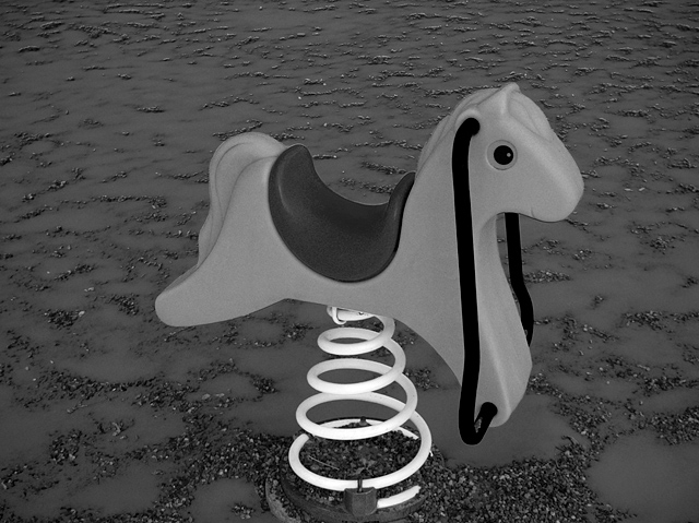
| This fits the challenge well, but I don't think black and white adds anything to this shot. The centered composition is a bit too much for such a simple subject. |
|
|
|
01/02/2005 08:54:37 AM |
| would be better with a bit shifted centre and brighter horse (esp. compared to the spring (or spiral or how it's called)) |
|
|
|
01/02/2005 08:40:44 AM |
| Striking photo with interesting conversion to B/W. Perhaps a little too centred? |
|
|
|
01/01/2005 07:39:59 AM |
| neat colors...I like the color of the spring. |
|
|
|
12/31/2004 03:42:45 PM |
| Awesome! The background is just interesting enough without distracting from the subject. |
|
|
|
12/30/2004 01:13:16 AM |
| I like how the spring almost lights up and the background is intersting and yet not distracting. Very nice. My only recomendation is that you brighten the horse a little to make it stand out a little more. Nice job |
|
|
|
12/29/2004 03:32:30 PM |
| Aha, I really like the looks of this picture... The long backround makes the horse stand out. If you wanted to get rid of some of the noise on the horse you can use Neat Image- it's free. |
|
|
|
12/29/2004 09:23:38 AM |
| Cute as hell. I wish there were more "pop" in the horsey, and the tight cropping at bottom is a major flaw to me eye. |
|
|
|
12/29/2004 08:59:54 AM |
| I like the simplicity of this one, but I'd probably have gone for something other than a dead-on center approach. |
|
|
|
12/28/2004 07:50:07 PM |
| Nice black and white, especially the strongly highlighted spring. It makes me think of some weird alien lifeforce, especially with the strange landscape. Well done. |
|
Home -
Challenges -
Community -
League -
Photos -
Cameras -
Lenses -
Learn -
Help -
Terms of Use -
Privacy -
Top ^
DPChallenge, and website content and design, Copyright © 2001-2025 Challenging Technologies, LLC.
All digital photo copyrights belong to the photographers and may not be used without permission.
Current Server Time: 04/07/2025 10:30:09 PM EDT.