| Author | Thread |
|
|
03/06/2003 11:45:04 AM |
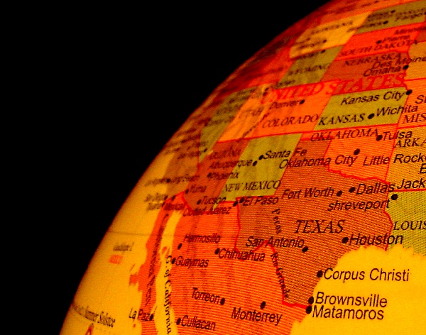
I think this would have come out a lot better, if the globe was originally a more "realistic" looking earth color. I also think that the state/city names are very destracting.
I do, however, really like the low angle of this shot. I like the sharp focus on texas, and how it gradually fades out when looking at the other states. The stark, black background really highlights the brightness of the globe. |
|
 Photographer found comment helpful. Photographer found comment helpful. |
Comments Made During the Challenge  |
|
|
03/02/2003 05:11:32 AM |
| Colourful... but kind of a dull idea. I can see it having stock photography applications, but only in a very literal sense, for material that is specifically about Texas. |
|
| Photographer found comment helpful. |
|
|
03/01/2003 05:29:50 PM |
| I like this and think it works for the challenge. It seems a little too orange though. |
|
| Photographer found comment helpful. |
|
|
03/01/2003 04:48:30 PM |
| You'd think they'd include the Capital. |
|
| Photographer found comment helpful. |
|
|
02/28/2003 03:36:14 PM |
|
| Photographer found comment helpful. |
|
|
02/28/2003 02:21:56 PM |
| Very well taken shot. Extremely clear. Color seems about right. Framing works very well for me. Nice use of negative space. Not certain about the number of applications for this stock, but I won't quibble. 9 Swash |
|
| Photographer found comment helpful. |
|
|
02/27/2003 07:23:36 AM |
| I can see this being used in an article with text overlayed on the black background, so the challenge is definitely met. I like the nice even black background and the warm colors of your globe. Focus is good, too, although I could see this cropped a little more at the bottom and left, because rather than Texas, I'm more drawn to the yellow corner with the large writing (part of which denotes cities in Texas, I know). That's where the eye usually wanders in a photo, the lighter places. Overall, a good submission. :) |
|
| Photographer found comment helpful. |
|
|
02/27/2003 05:42:54 AM |
| I can picture this on the wall of many varied businesses or learning establishments, a great job. 9 |
|
| Photographer found comment helpful. |
|
|
02/26/2003 06:41:24 PM |
| Orginal, great clarity and lighting. |
|
| Photographer found comment helpful. |
|
|
02/25/2003 05:32:27 PM |
| Yup. I could definitely see this being useful stock photo-wise. |
|
| Photographer found comment helpful. |
|
|
02/25/2003 03:44:26 AM |
| interesting perspective... Don't mess with Texas :) - setzler |
|
| Photographer found comment helpful. |
|
|
02/24/2003 04:07:06 AM |
| Nice job of the selective focus to emphasize a particular American state. The use of the black background leaves room for a caption if necessary and leaves room if an editor wants to crop this to a vertical without destroying the picture. |
|
| Photographer found comment helpful. |
|
|
02/23/2003 07:32:25 PM |
| Very clever, but I think it would have had more "punch" with a spotlight on Texas and the rest of the states blurred slightly. I love the whole idea of it! |
|
| Photographer found comment helpful. |
Home -
Challenges -
Community -
League -
Photos -
Cameras -
Lenses -
Learn -
Help -
Terms of Use -
Privacy -
Top ^
DPChallenge, and website content and design, Copyright © 2001-2025 Challenging Technologies, LLC.
All digital photo copyrights belong to the photographers and may not be used without permission.
Current Server Time: 04/07/2025 01:06:16 PM EDT.