| Author | Thread |
|
|
03/08/2003 04:54:54 PM |
Critique Club critique by Tim Jensen.
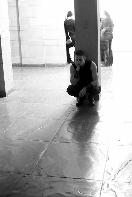
First of all, I like this concept quite a bit. However I am not especially happy with the composition. I do not feel that the way the pole is positioned between the people in the background as well as the close proximity of everyone lends itself well to the concept. What I would have tried is to position the pole and the young man along the left edge and closer to the camera and the background people more to the right edge, allowing for some distance between them. As it is now, most of the foreground space is not being effectively used and could be better used to visually convey the sense of separation that you intended. By reframing the scene you should be able to eliminate the distracting wall edge on the left side or show more of it and use it as a compositional element.
I have no particular issues with the lighting. I think you handled that pretty well. I would not have guessed that it was taken in a nearly black room. There is a nice powerful tonal range though I feel that the darkest areas, such as the young man's shirt could be even darker. The choice of black and white was a good one as it supports the isolation theme very well.
The location with it's openness and subtle textures was very appropriate for this image. I almost get the feeling that you could get lost and really feel alone in a building like this.
This photo certainly meets the theme quite well and is properly executed with clean sharp lines. Nice job.
Tim |
|
|
|
03/03/2003 01:58:45 AM |
Thanx for the comments folks. Some of you didn't understand despair or the background, so here's what I was trying to go for while taking the photo. I guess I paid too much attention in English class, because I'm a fan of symbolism and underlaying meaning.
I was trying to portray the despair of loneliness. The first idea that came to mind was the cliche phrase "Odd Man Out." So, I had my subject knell with a somber look facing towards the camera. The people in the background were placed there intentionally. They are facing away from the camera and are in a circle facing each other to create the sense of a clique that the subject does not belong to. The overexposure is meant to further the notion of alienation by putting them and the background in extreme lightness, while the main subject remains in the darkened shadow of the pillar.
Not sure if the photo had the effect I intended. From the comments it looks about 50/50. Maybe I was trying to put too much ulterior meaning into the photo. |
|
Comments Made During the Challenge  |
|
|
03/01/2003 11:17:03 PM |
| This would have been stronger without the distraction of the people in the background. |
|
 Photographer found comment helpful. Photographer found comment helpful. |
|
|
03/01/2003 12:36:49 AM |
| i don't really undrestand what is going on in the background but i like the b&w and and how the guy really looks as if he is in despair |
|
| Photographer found comment helpful. |
|
|
02/27/2003 05:35:22 PM |
| I really like the overexposed background, it adds a spacey feel to the shot. I might have had the subject even further to the right of frame but otherwise this is really good. Well done. |
|
| Photographer found comment helpful. |
|
|
02/27/2003 09:57:33 AM |
| nice image i get the feeling that your subject is thinking about killing the other people. Good work TIFF says 7! |
|
| Photographer found comment helpful. |
|
|
02/26/2003 03:09:47 PM |
| Very nice but not sure where the despair theme is carried. out |
|
| Photographer found comment helpful. |
|
|
02/24/2003 08:15:51 PM |
| Overall, the exposure is too much, and the depiction of "despair" is a bit weak, IMO. I do like your composition. |
|
| Photographer found comment helpful. |
|
|
02/24/2003 02:21:08 PM |
| nice photo, i like the colors. |
|
| Photographer found comment helpful. |
Home -
Challenges -
Community -
League -
Photos -
Cameras -
Lenses -
Learn -
Help -
Terms of Use -
Privacy -
Top ^
DPChallenge, and website content and design, Copyright © 2001-2026 Challenging Technologies, LLC.
All digital photo copyrights belong to the photographers and may not be used without permission.
Current Server Time: 02/01/2026 08:07:16 AM EST.