DPChallenge: A Digital Photography Contest You are not logged in. (log in or register
⚠️ Test site ⚠️
 
Challenge Entries
This image is not a part of any challenge.
Portfolio Images
Negotiated Services
Negotiated Services
PennyStreet


Photograph Information Photographer's Comments
Collection: Square Crop 2025
Camera: Olympus OM-D E-M1
Lens: Olympus 12-40mm f/2.8 Pro
Aperture: 3.5
ISO: 200
Shutter: 1/125
Date Uploaded: Dec 15, 2025

Viewed: 30
Comments: 4
Favorites: 0

PA277309sm

Please log in or register to add your comments!

AuthorThread
12/17/2025 11:04:14 AM
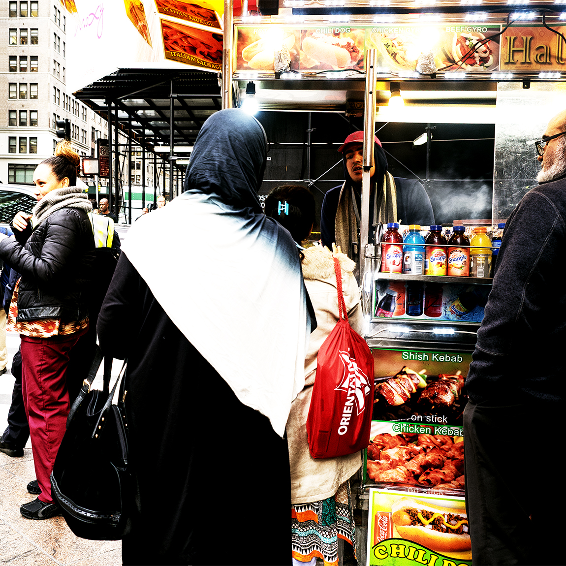
Personally, I'm a big fan of high-contrast color, too. I usually get punished by viewers any time I opt for it, though. I can't quite figure out why. My guess is that a lot of people respond to color differently because it creates a lot of visual information, and some people find it exhausting rather than inviting to have more rather than less visual information to consider. *shrugs* Obviously that's a very subjective thing.

With regards to this composition in particular, I would say the word "busy" is extremely apt. But I would also hasten to add that, for me, the word "busy" is not necessarily a critique. In this case, especially, it's complementary to other words I would use: "vibrant," "energetic," "sharp," and "noisy." And I would also add that the square crop distinctly works wonders on all of the above to make this feel like a distinctly kinetic candid moment of urban busyness and everyday commerce.

In short, I really respond to it positively. I can't quite articulate why. I would be genuinely interested to see how this would do in challenge voting, because I aspire to eventually be able to use color this way without it getting 3s and 4s. :-P
  Photographer found comment helpful.
12/17/2025 10:48:57 AM
Agreed that the shape of the scarf and colour adds interest. I personally like when colours don't match, things stand out, are maybe uncomfortable, etc..
  Photographer found comment helpful.
12/16/2025 11:58:44 AM
In response to Nikki, I love high contrast photos. I processed this also in monochrome and that bright white "scarf" blended in much differently. But I decided to go color, where, to me, the shape of the scarf draws interest, makes the eye want to go beyond it to see what else is there. Different opinions are always good.
12/16/2025 06:57:44 AM
I love the colors and all the interest. I'm sure others will enjoy the bright white across the central figure's back, but I'm struggling with it. Will be interested in reading subsequent comments as well as your own thoughts on the light.
  Photographer found comment helpful.


Home - Challenges - Community - League - Photos - Cameras - Lenses - Learn - Help - Terms of Use - Privacy - Top ^
DPChallenge, and website content and design, Copyright © 2001-2026 Challenging Technologies, LLC.
All digital photo copyrights belong to the photographers and may not be used without permission.
Current Server Time: 02/01/2026 05:19:11 AM EST.