| Author | Thread |
|
|
12/14/2025 12:21:11 AM |
| Wonderful colors suit the composition. Or is it the other way around? |
|
 Photographer found comment helpful. Photographer found comment helpful. |
|
|
12/12/2025 02:51:45 PM |
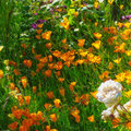
The placement and emphasis of the red in this frame and its balance with those complementary greens really helps tame what might otherwise be a visually overwhelming level of vividness in the color. As someone who enjoys vibrant, vivid colors in photography, this definitely appeals to me--and usually gets me low scores whenever I try it for a challenge. LOL
Message edited by author 2025-12-12 14:52:05. |
|
| Photographer found comment helpful. |
|
|
12/12/2025 02:20:51 PM |
| Great colors - funny to think of this as spring when the colors are perfect Christmas and that's winter here! Great composition. |
|
| Photographer found comment helpful. |
Home -
Challenges -
Community -
League -
Photos -
Cameras -
Lenses -
Learn -
Help -
Terms of Use -
Privacy -
Top ^
DPChallenge, and website content and design, Copyright © 2001-2026 Challenging Technologies, LLC.
All digital photo copyrights belong to the photographers and may not be used without permission.
Current Server Time: 02/01/2026 05:43:21 AM EST.