| Author | Thread |
|
|
03/09/2003 04:37:25 PM |
Good theme. Nice cropping. You might want to try this in black & white. The white spots are a little distracting. Overall nice job.
Message edited by HBunch - Removed Critique Club status. |
|
Comments Made During the Challenge  |
|
|
03/02/2003 12:10:35 PM |
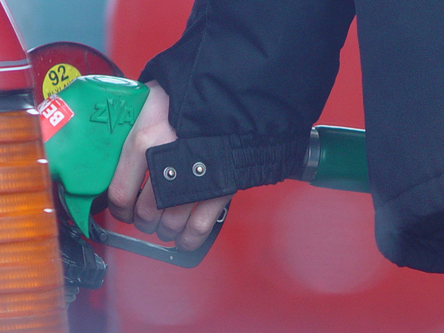
| Looks as though your lens had some droplets of water on it? I'm afraid that takes a bit away from the shot. |
|
|
|
03/02/2003 11:41:14 AM |
| Nice simple shot, but those white blotches at the bottom are killers, especially if you want a sellable shot. |
|
|
|
03/02/2003 06:50:00 AM |
| Good as a photojournalistic image, however the colours are very washed out. The contrast needs to be increased. |
|
|
|
03/01/2003 05:34:38 PM |
| I like this a lot. The colors and composition are great. It does seem a little too grainey though. |
|
|
|
02/27/2003 07:03:17 AM |
| I can relate:). There is some noise, Neat Image would help clean this up. Also seems a bit grey, increasing the contrast would improve this shot. Nice composition. |
|
|
|
02/27/2003 03:21:24 AM |
| The idea here is very good and if it hadn't been for those two white circular blurs there and a little more saturation this photo would have been excellent. |
|
|
|
02/26/2003 08:56:53 PM |
| wow I like the composition of the shot.. works really well, but there is something on the lens or near the lens giving a white haze that messes the shot up |
|
|
|
02/25/2003 05:22:39 PM |
| Good idea. Well, actually, a great idea. The lens flares in the center of the image distract, unfortunately, and the colors should be more vibrant. Perhaps also changing your angle just slightly to the right (to get rid of the taillight) would also help this out. Great idea...very simple, and the kind of shot I can never find when I need it. |
|
|
|
02/25/2003 02:42:15 PM |
| Meets challenge well. Splothces in lower half are a little distracting |
|
|
|
02/25/2003 07:22:39 AM |
| You have some light reflecting in the picture, but it's a good idea |
|
|
|
02/25/2003 03:28:46 AM |
| I think the stock concept on this photo is excellent, but I think the large light spots on the bottom portion of the image are a bit distracting from the theme... - setzler |
|
|
|
02/25/2003 03:26:45 AM |
| Great idea. Unfortunately the sun splashes detract from its possibiities for stock. 6 Jak |
|
|
|
02/25/2003 12:58:35 AM |
| i like it, highly usable. A little more contrast could help |
|
|
|
02/24/2003 05:59:29 PM |
| where did that flare come from? or is that crap on your lens? a neat idea, just a shame about the blue blobs |
|
|
|
02/24/2003 02:13:06 PM |
| Kind of a photojournalism-y feel to this, with a candid sort of air. I like those lens flares (?). They make it seem somehow cold out! |
|
|
|
02/24/2003 11:05:12 AM |
| Good basic composition and idea, but the spots are very distracting. Was there water on your lens? |
|
|
|
02/24/2003 02:57:43 AM |
| Are those snowflakes or water on your lens? Sorry, but those two drops really put me off this image. A good idea, but nobody would buy the image - they would instead send one of their own photographers to the nearest petrol station. (4) |
|
Home -
Challenges -
Community -
League -
Photos -
Cameras -
Lenses -
Learn -
Help -
Terms of Use -
Privacy -
Top ^
DPChallenge, and website content and design, Copyright © 2001-2025 Challenging Technologies, LLC.
All digital photo copyrights belong to the photographers and may not be used without permission.
Current Server Time: 04/09/2025 01:41:03 PM EDT.