| Author | Thread |
Comments Made During the Challenge  |
|
|
12/20/2004 06:32:37 AM |
| extremely awkward cropping, borderline ugly image tonalities |
|
|
|
12/17/2004 09:59:35 PM |
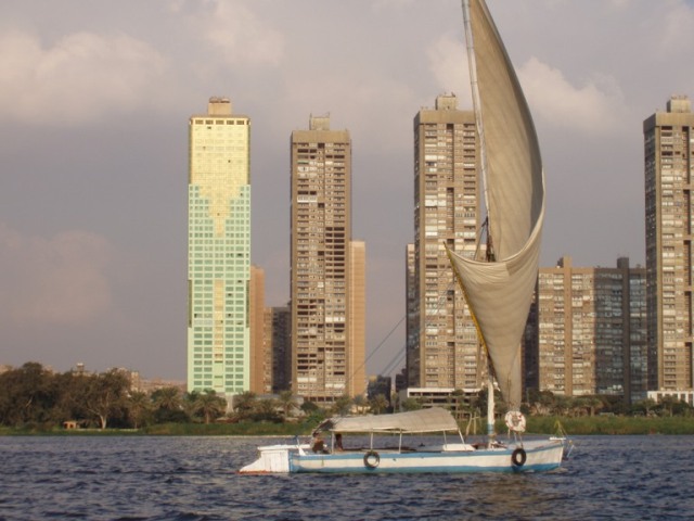
| Soo close, composition wise...more to your right and put the sale in line with teh high rises (to their left in the empty space in this pic) and you have something. What you have now is the sale getting lost in the buildings (in color and shape (vertical)) and the empty space is behind the boat...normally it is in front of the boat (car/plane/train/person walking). The pic seems a bit flat too - try USM 35%/60/1 and see if that helps make it 'pop' a bit. |
|
 Photographer found comment helpful. Photographer found comment helpful. |
|
|
12/16/2004 10:25:59 PM |
| it seems to me a very nice shot. Congratulation for the good position, back ground,scence and your activity. |
|
| Photographer found comment helpful. |
|
|
12/16/2004 07:12:16 AM |
| Wow! It could have been much better with a little sharpness. |
|
| Photographer found comment helpful. |
|
|
12/15/2004 07:19:54 AM |
| Composition: 7, Technical: 5, Appeal: 5, Challenge: 7, Overall Calculated Average Score: 6 |
|
| Photographer found comment helpful. |
|
|
12/14/2004 10:23:53 PM |
| Too much conflict with the background |
|
| Photographer found comment helpful. |
|
|
12/14/2004 07:47:04 PM |
| This looks like Hong Kong... |
|
| Photographer found comment helpful. |
|
|
12/14/2004 07:43:04 PM |
| Nice, but the whole thing seems a bit soft. The colors look very natural, but I might like it better if they were punched up a bit. |
|
| Photographer found comment helpful. |
Home -
Challenges -
Community -
League -
Photos -
Cameras -
Lenses -
Learn -
Help -
Terms of Use -
Privacy -
Top ^
DPChallenge, and website content and design, Copyright © 2001-2025 Challenging Technologies, LLC.
All digital photo copyrights belong to the photographers and may not be used without permission.
Current Server Time: 04/07/2025 04:23:31 AM EDT.