| Author | Thread |
|
|
12/27/2004 03:29:36 PM |
***CRITIQUE CLUB RESPONSE***
Ivaldovi,
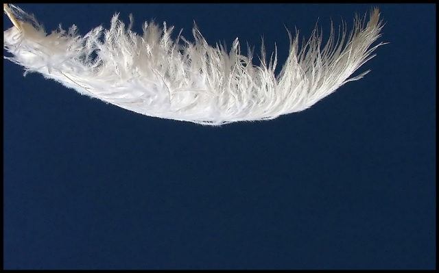
There's a lot to like in this image, but just as much keeping me from liking it a LOT, if you get my drift. I'm going to discuss the picture outside the context of the challenge, if that's ok? The reason is, as a "wind" challenge entry I don't think it works especially well, speaking more to me of serentity than of the turmoil of wind. You'll understand what I mean if you think of "Forrest Gump"; when the feather was floating around it was soft and swoopy, not being carried agressively by a wind. In fact, what was noticeable in "Gump" was the absence[/i) of wind, the condition of a feather falling in calm conditions.
The more I look at this picture, the more I deduce it was either shot vertically (in an actual breeze) and rotated 90 degrees, or perhaps shot with the arch up and the downy feathers hanging through fravity, then rotated 180 degrees. Speaking of the orientation of the image now, it is lit from directly below.
As has been mentioned by several critiquers, the framing of the shot is unfortunate; the image is too far up and the feather is truncated on the left. From this I deduce that you were probably [i]holding the feather, perhaps in your fingers, and thus had no choice but to cut the shaft off where you did. Regard;less of how this came about, it seems a bad decision to me. I'd really like to see the entire feather here, it's the only way you can really give me that sense of floating free that the image needs so badly. Condisering the extreme darkness of the background, you probably could have done this with a very thin wire inserted into the shaft and spray-painted matte black.
Another issue is the lighting. While it's not bad, I feel it could be improved if the light source were not only beaneath the feather but also a little behind it, so there's a trace of translucent backlighting. Did you try this?
Finally, given that the challenge is "wind" it might have been better not to have the feather so squared up within the frame, but rather at some sort of an angle. This could be just a matter of the same edge-on view but a less-horizontal alignment, but arguably the feather itself should be twsited somewhat in 3 dimensions. In other words, while keeping the same edge-on view, perhaps rotate the feather about its shaft so the far side is a little higher than the near side. Then rotate the feathet like a clock face, so it's maybe 30 degrees off vertical. This ought to bring a little more dynamics to the image, suggest a sense of movement.
These suggestions are not that radically different from what you've done, just a matter of tweaking things for a less-static image.
Let me know if you do any more experimenting with this...
Robt.
Message edited by author 2004-12-27 21:45:57. |
|
 Photographer found comment helpful. Photographer found comment helpful. |
Comments Made During the Challenge  |
|
|
12/21/2004 03:57:16 AM |
| Nice softness, and good composition. However, with the end of the feather cropped, it's hard to get the feeling that this is floating. |
|
|
|
12/20/2004 10:26:43 PM |
| Reminds me of Forest Gump, 7 |
|
|
|
12/20/2004 10:17:27 PM |
| Forrest Gump's feather? Very pretty white feather against a midnight-blue background. Like it! |
|
|
|
12/20/2004 06:36:37 AM |
| The framing on this image is awkward, trhe feather should be down and right a little bit. the addition of the :frame" around the image doesn't really help |
|
|
|
12/19/2004 05:56:42 PM |
| It would have been better to see the whole feather. I like the upper left placement. |
|
|
|
12/18/2004 04:53:08 PM |
| Reminds me of the Forest Gump scene. |
|
|
|
12/17/2004 09:56:38 PM |
| When i see a white feather floating, i think of the opening and closing shots of the movie Forrest Gump. This shot leaves a lot lacking...technically it might be fine. But the composition/crop lacks interest. the border would be better in white as the black has no connection to the image and darkens the already too dark 9to me) background. |
|
|
|
12/17/2004 07:33:08 AM |
|
|
|
12/16/2004 06:28:17 PM |
| This might be too tight of a crop - seeing more of the surroundings (preferably empty sky) would better convey the sense of free flying. As is - 6. |
|
|
|
12/16/2004 02:53:48 PM |
|
|
|
12/16/2004 08:50:10 AM |
|
|
|
12/16/2004 08:29:29 AM |
| I think I would liked to have seen the entire feather. The contrast of the feather and the background is nice. |
|
| Photographer found comment helpful. |
|
|
12/15/2004 06:14:52 PM |
| I like the colors and using the rot, creating an unbalanced negative space at the bottom. There are two things that I have a minor problem with. The compostion imples symetry to me, the way it's cut different on the left than one the right is a littel bothersome. There is a lot of noice in the blue part of the image. Both are minor nits and are just my opinion - overall, good job. |
|
| Photographer found comment helpful. |
|
|
12/15/2004 03:43:47 PM |
| Great title and excellent idea for a subject one I wish I had thought of! IMHO if this had been composed to show the feather floating freely without an implication that someone might be holding it... with a natural sky backround this would be a top contender for me. As it is nicly done! |
|
| Photographer found comment helpful. |
|
|
12/15/2004 01:21:22 PM |
| Nice macro, I was going to submit something similar. Feather is positioned a little high in the frame and I wish it wasn't cut off in the upper left. Best of luck to you. |
|
| Photographer found comment helpful. |
|
|
12/15/2004 11:42:48 AM |
| Well done. Elegant simplicity, gracefully executed in an artistically and technically pleasing manner. Excellent backdrop to contrast with the falling feather. Your title is kinda hokey though. |
|
| Photographer found comment helpful. |
|
|
12/15/2004 08:09:27 AM |
| Composition: 7, Technical: 6, Appeal: 6, Challenge: 7, Overall Calculated Average Score: 7 |
|
| Photographer found comment helpful. |
|
|
12/14/2004 11:53:13 PM |
| love the idea but think that a different angle would have given this photo more appeal |
|
| Photographer found comment helpful. |
|
|
12/14/2004 07:45:51 PM |
|
Home -
Challenges -
Community -
League -
Photos -
Cameras -
Lenses -
Learn -
Help -
Terms of Use -
Privacy -
Top ^
DPChallenge, and website content and design, Copyright © 2001-2025 Challenging Technologies, LLC.
All digital photo copyrights belong to the photographers and may not be used without permission.
Current Server Time: 04/07/2025 01:08:57 PM EDT.