| Author | Thread |
Comments Made During the Challenge  |
|
|
12/18/2004 09:21:44 PM |
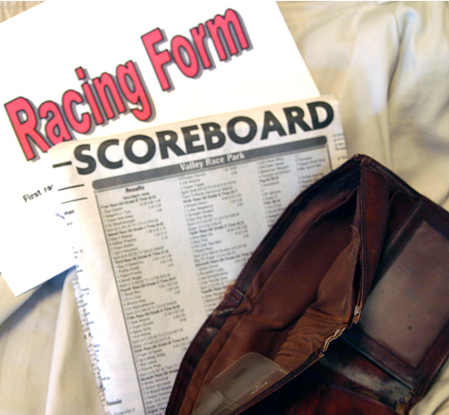
| creative interpretation, but i would've liked to see more focus and perhaps could've lost the big 'Racing Form' sheet, as it doesn't look too authentic - maybe some other things in the wallet could make it seem more used (an ID?). either way, good idea. |
|
 Photographer found comment helpful. Photographer found comment helpful. |
|
|
12/18/2004 01:26:16 PM |
| That brings back memories. The form and handicap sheet seem a bit washed out. I might have tried a darker background and diffused lighting. |
|
| Photographer found comment helpful. |
|
|
12/15/2004 09:29:41 AM |
| Interesting take, but the picture is a little soft. |
|
| Photographer found comment helpful. |
|
|
12/14/2004 11:03:51 AM |
| Missed the theme in my opinion. |
|
| Photographer found comment helpful. |
|
|
12/13/2004 08:13:14 AM |
| That's your problem...bet on horses instead. :) The layout could use a lot of improvement. The background doesn't enhance the picture. The main part of the photo, Scoreboard, is way too out of focus. |
|
| Photographer found comment helpful. |
|
|
12/13/2004 06:14:47 AM |
| I think that the scoreboard was sufficient. Big red letters saying :Racing form" just take the attention away from the wallet |
|
| Photographer found comment helpful. |
|
|
12/13/2004 05:49:27 AM |
| broke is not the same as bkokeN. Also, the pics seems a tad soft or perhaps oversharpened - not sure, but it looks off somehow. |
|
| Photographer found comment helpful. |
Home -
Challenges -
Community -
League -
Photos -
Cameras -
Lenses -
Learn -
Help -
Terms of Use -
Privacy -
Top ^
DPChallenge, and website content and design, Copyright © 2001-2025 Challenging Technologies, LLC.
All digital photo copyrights belong to the photographers and may not be used without permission.
Current Server Time: 04/07/2025 01:33:00 PM EDT.