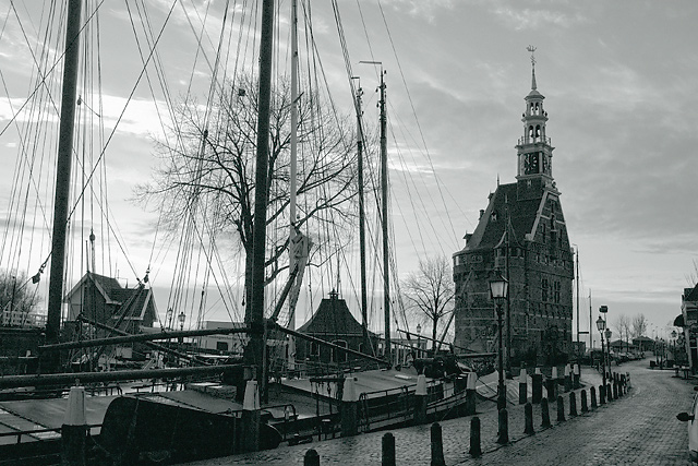
The 'Hoofdtoren', not the first time I used it as a subject, see thumbs below.
First stone building is from 1532, the roof and clock tower are added later. It served as a lighthouse, defence tower and at this moment it is a restaurant. You can start a nice historic guided tour trough the city here, enjoying parts of a dinner in several restaurants. Ask the tourist office for "Hap and Stap".
I have done enough windmills already as landmarks, that would be boring for the viewer and for me. So when the sunrise was good on sunday morning I went to the city early and tried to grab the tower in early sunlight from the harbour entry side. Unfortunately they are still busy with restoration on that side, so I had to shoot the shadow side, giving a very flat, dark exposure. This is one of the reasons why it is B&W (sort of).
I don't expect it to do so well, because it is grainy, still too dark, busy and not cropped right (lower right side). I hope that you like the composition.
Post processing:
The original has a good sky but all the subjects in front are very, very dark.
Nikon Capture: - Digital DEE @ standard settings
- Exposure compensation +1/3 EV
- Whitebalance changed to Daylight, Cloudy
- Moiré reduction @ medium
- Noise reduction @ 1
Photoshop 6 - Chroma Noise reduction
- Rotation of app 2 degr. cw
- crop out the usable image
- Fred Miranda B&W pro, standard B&W, Tritone to Green/Mauve/Black
- Levels
- Resample
- USM 150%, 0.3 radius, treshold 2
The 3000x2000 original after the Digital DEE, exposure compensation and toning is incredibly grainy. It looks a bit like 1 stop pushed ISO1600 B&W film. Resampled to 640 wide it looks pretty decent.
ExposureProgram : Aperture Priority
DateTimeDigitized : 2004:12:05 09:37:45
(my clock is still on summer time)
MeteringMode : Division
FocalLength : 24,00(mm)
FocalLength(35mm) : 36(mm)
Statistics
Place: 48 out of 143 Avg (all users): 5.9158 Avg (commenters): 6.2500 Avg (participants): 5.6277 Avg (non-participants): 6.1667 Views since voting: 827 Views during voting: 272 Votes: 202 Comments: 10 Favorites: 2 (view)
I like lights and toning of your picture... place is interesting too but i feel compozition bit strange. I would leaved ships out for sure... they distract from lighthouse and doesnt add much to picture.
I like this shot, but the crop bothers me a bit. I would have liked to see both sides of the street if possible. My eye seems to drift out of the frame on the right. Still very nice. The building looks very interesting. I would love to see a closer view of it. 8.
Nice b&w, looks like the left side of this things is a little busy. And maybe have the bottom of the photo show, the road coming to the camera might look interesting.